Preview image. Unlock full-res
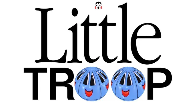
White card built entirely from a playful "Little TROOP" wordmark, mixing a classic serif and a bold sans where the O's become blue smiling toy faces.
Summary
A wordmark-only card where the studio name is the whole image: "Little" in an elegant serif over "TROOP" in a heavy sans, with two of the letters swapped for grinning blue toy-ball characters.
Visual description
A plain white card. "Little" sits on top in a refined black italic-leaning serif. Below it, "TROOP" is set in a thick black sans-serif, but the two O's are replaced by blue spherical characters with cartoonish vented faces and red open mouths, like smiling toy balls. A tiny matching face also sits as the dot above the first letter. The contrast of a classy serif with a chunky sans, plus the mascot-as-letterform trick, makes the logotype itself the hero.
Key takeaway
Building the entire card from a single expressive logotype and substituting letters with brand characters. Mixing a delicate serif with a heavy sans in one wordmark creates instant personality with zero supporting graphics.
Reuse notes
Great for a studio, toy brand, or playful agency with a strong logotype and a mascot to lean on. Needs distinctive letterforms and a character that reads at small sizes; not suited to brands without a built-in visual mark.