Preview image. Unlock full-res
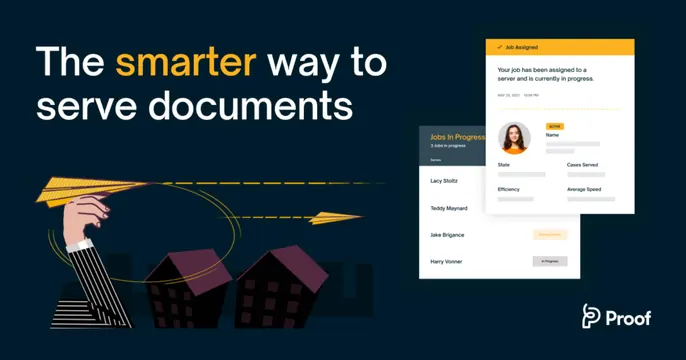
Dark split OG card pairing a headline and paper-plane illustration on the left with product UI cards on the right.
Summary
A dark navy card split into a headline-plus-illustration left half and a product-UI right half, for a document-serving service.
Visual description
A deep navy background spans the card. The left half holds a bold white headline "The smarter way to serve documents," with the word "smarter" picked out in yellow, sitting above a flat spot-illustration of a hand launching a yellow paper plane on a dashed flight path over dark rooftops. The right half floats two light product cards: a "Jobs In Progress" list of names with status pills, and an overlapping "Job Assigned" detail card showing a round avatar, an "ACTIVE" tag, and labeled fields (State, Cases Served, Efficiency, Average Speed). The "Proof" wordmark with its icon sits in the bottom-right corner. Yellow is the single accent, tying the headline, plane, and status tags together.
Key takeaway
Splitting the card into "story" (headline plus illustration) and "proof" (real product cards) so it both pitches and demonstrates. A single accent color carried from the headline word into the illustration and the UI tags unifies an otherwise busy composition.
Reuse notes
Strong for a B2B or legal-tech SaaS that needs to explain an abstract service. The spot illustration humanizes a dry category; the floating product cards keep it credible. Keep the UI cards light against the dark ground so they read at small sizes, and reserve one accent color for cohesion.