Preview image. Unlock full-res
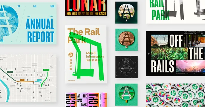
Dense portfolio collage of Rail Park branding work tiled edge to edge as a single mosaic of case-study thumbnails.
Summary
A maximalist portfolio card that tiles a studio's Rail Park branding project into one full-bleed mosaic, letting the volume and color of the work speak instead of any single statement.
Visual description
The whole 1200x630 frame is packed with rectangular case-study tiles butted directly against each other with no gutters. An annual report cover in pale blue with blue sans-serif type sits top left, a red Lunar New Year poster top center, a green "RAIL PARK" wordmark on white top right, and an "OFF THE RAILS" dark editorial layout with railway photos on the right. The lower band carries a city map, enamel pins of the angular A-frame logo, a black mark on a starry tile, and a tray of colorful pinback buttons. A large white "The Rail Park / Map & Information" booklet with a bold green swing illustration anchors the center. Green, red, blue and gold recur across the tiles.
Key takeaway
Showing a whole identity system as one seamless gutterless mosaic so the OG card reads as proof of range at a glance. The repeating angular logo and the green/red/blue accent palette tie wildly different artifacts into one coherent grid.
Reuse notes
Strong for a design studio or branding portfolio share where breadth of output is the selling point. Needs genuinely attractive individual pieces since every tile is visible. Avoid if you need a single readable headline; this is texture, not message.