Preview image. Unlock full-res
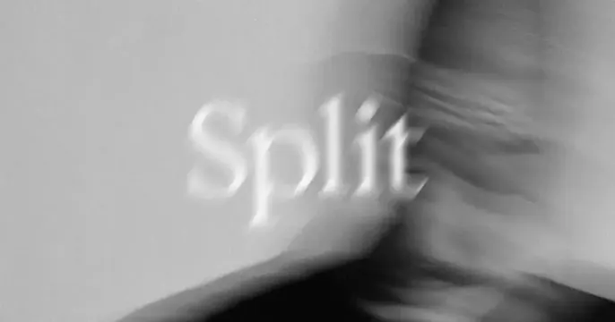
Grainy black-and-white card with the word Split in blurred serif type over a motion-blurred monochrome photograph.
Summary
A grainy, motion-blurred black-and-white card with the brand name "Split" set in a soft serif and smeared into the photograph behind it for a moody, art-directed feel.
Visual description
The whole frame is a desaturated grey, heavily grained monochrome photograph whose subject is abstracted by strong motion blur into soft folds and an indistinct shadowed form sweeping in from the right. Centered over it, the word "Split" sits in a light serif that is itself blurred, the glyphs catching faint highlights so the wordmark seems to dissolve into the image. There is no other text or mark; the grain and blur unify type and photo into one hazy surface.
Key takeaway
Blurring the wordmark to the same degree as the photograph so type and image read as a single atmospheric texture, an art-house, fashion-editorial move that prioritizes mood over legibility. The film grain and monochrome keep it feeling crafted and analog.
Reuse notes
Suits a fashion, watch, fragrance, or design-led brand share that wants intrigue over clarity. Risky: the blur sacrifices legibility, so only use where the surrounding context carries the name. Monochrome and grain are essential to the effect.