Preview image. Unlock full-res
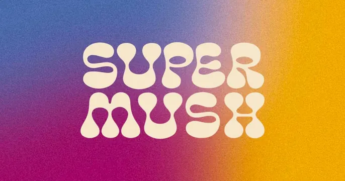
Grainy multicolor gradient card with a chunky retro "SUPER MUSH" wordmark in soft cream bubble letters.
Summary
A grainy gradient card sweeping from blue through magenta to orange, with a fat retro "SUPER MUSH" wordmark in soft cream rounded letters stacked over two lines.
Visual description
The background is a noisy, film-grain gradient that runs diagonally from cobalt blue at top-left through hot magenta to warm orange-yellow at the right. Centered, "SUPER" sits above "MUSH" in a thick, groovy 1970s-style display face with rounded, blobby cream-colored letterforms that nearly touch. The grain gives the whole thing a tactile, slightly psychedelic texture. No tagline or other element appears.
Key takeaway
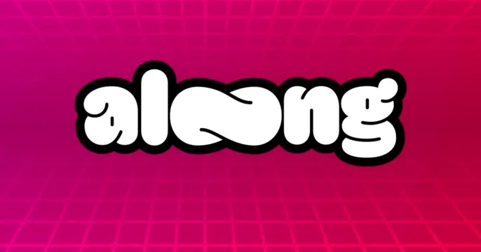
Pairing a heavy retro bubble typeface with a multi-stop grainy gradient. The cream type stays soft and friendly against the saturated background, and the grain keeps the gradient from feeling flat or sterile, giving an instantly nostalgic, wellness-adjacent vibe.
Reuse notes
Strong for playful consumer, wellness, and food brands wanting a warm 70s mood. The groovy face is the personality; keep it the only element. Make sure the type color contrasts enough with the busiest part of the gradient so it stays readable when shared small.