Preview image. Unlock full-res
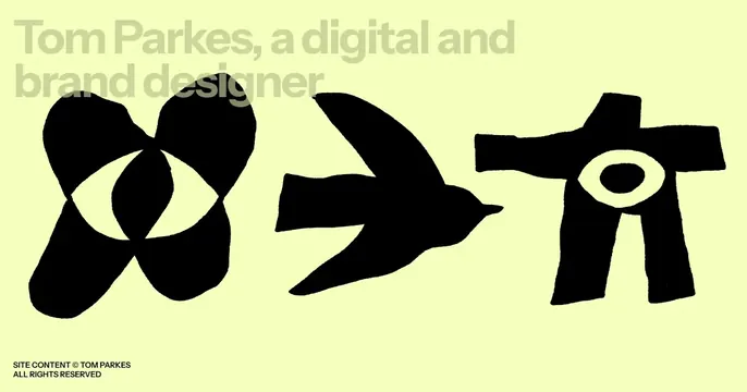
Pale-yellow card with three hand-drawn black symbols and a low-contrast tonal headline naming a digital and brand designer.
Summary
A warm, art-directed personal card on pale chartreuse, anchored by three bold hand-drawn black symbols and a tonal headline introducing a designer. The defining move is the low-contrast, same-family headline that whispers while the painted marks shout.
Visual description
A soft yellow-green background. Across the center sit three chunky hand-painted black symbols: an eye-like infinity/butterfly shape, a flying bird, and a stick-figure or totem with a central eye, all with rough marker edges. The headline "Tom Parkes, a digital and brand designer" runs across the top in a slightly darker yellow-green than the background, so it reads as a subtle tonal layer rather than a hard contrast. A tiny "SITE CONTENT (c) TOM PARKES / ALL RIGHTS RESERVED" credit sits in solid black at the lower-left.
Key takeaway
Setting the headline in a near-identical tone to the background so type recedes and the hand-drawn marks carry the energy. The imperfect, painterly symbols give a personal site instant craft and warmth. The small hard-black credit line provides just enough contrast to ground the composition.
Reuse notes
Ideal for illustrators, brand designers, or studios that want a tactile, gallery-like feel. The tonal headline is a deliberate quiet move; only use it when the imagery is strong enough to lead and legibility of the headline is not critical. Custom hand-drawn marks are the load-bearing element, so they must be genuinely good.