Preview image. Unlock full-res
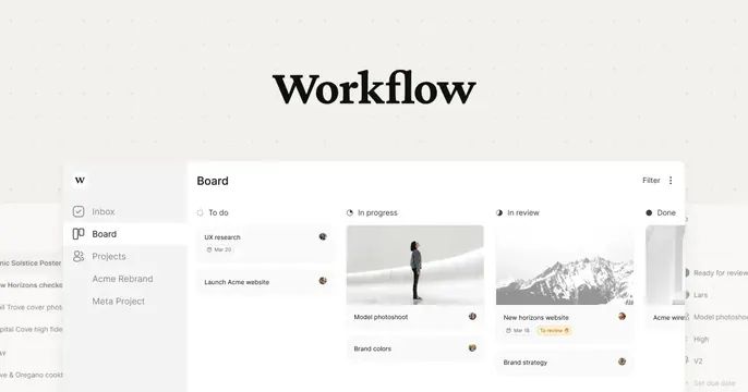
Off-white OG card with a serif Workflow wordmark above a clean kanban board product UI.
Summary
A quiet, neutral OG card pairing a high-contrast serif Workflow wordmark with a realistic kanban-board product screenshot below it.
Visual description
The background is a warm off-white with a faint dotted grid texture. Centered in the upper third, "Workflow" is set in a bold black serif display face. Below, a clean project-management UI fills the lower half: a left sidebar with a small "W" tile and nav items (Inbox, Board, Projects, Acme Rebrand, Meta Project), and a "Board" view with four kanban columns labeled To do, In progress, In review, and Done. Cards inside the columns carry task titles, small date chips, status tags, and circular member avatars; one shows a person photo, another a mountain photo. The UI panel sits on a white surface with soft rounded corners and bleeds off the bottom edge. The overall feel is restrained and editorial, with the serif logo contrasting against the modern app.
Key takeaway
Pairing a literary serif wordmark with a crisp SaaS screenshot is an unexpected combination that reads as premium and considered rather than generic-tech. The faint dot grid adds texture without noise.
Reuse notes
Strong default for a design-led productivity or project tool. Needs a genuinely tidy product screenshot to carry the bottom half. The neutral palette is safe and reusable; swap the serif for a sans to make it feel more conventional.