Preview image. Unlock full-res
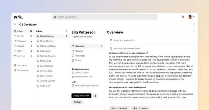
Full-bleed Wrk applicant-tracking UI screenshot over a soft pastel gradient frame.
Summary
An OG card that is almost entirely a clean recruiting-software screenshot, floated on a pale blue-to-peach gradient so the product is the whole message.
Visual description
A soft horizontal gradient runs from pale periwinkle blue at the left to warm peach at the right, visible only as a thin frame. Filling nearly the entire card is a white application window for the "wrk." applicant-tracking product. A top bar shows the lowercase "wrk." logo, a "Search candidates" field, a notification bell, and a user avatar. Below, a three-pane layout: a left rail of pipeline stages (Inbox, Screen, Interview, Decide, Offer, Archive) with counts, a candidate list column centered on "Ella Patterson," a detail column with the candidate's contact info and a black "Move to Screen" button, and a wide right panel titled "Overview" showing application question responses in body text. The UI is crisp, gray-on-white, with a single black primary button as the only strong accent.
Key takeaway
Letting a well-built product screenshot fill 95 percent of the card and using only a thin pastel gradient as a frame. The lone black button gives the otherwise neutral UI a clear focal point.
Reuse notes
Ideal for a B2B SaaS where the interface itself is the selling point and looks good at small sizes. Requires a screenshot that stays legible when scaled down for a social thumbnail. The pastel frame keeps it soft; a darker frame would feel more enterprise.