Preview image. Unlock full-res
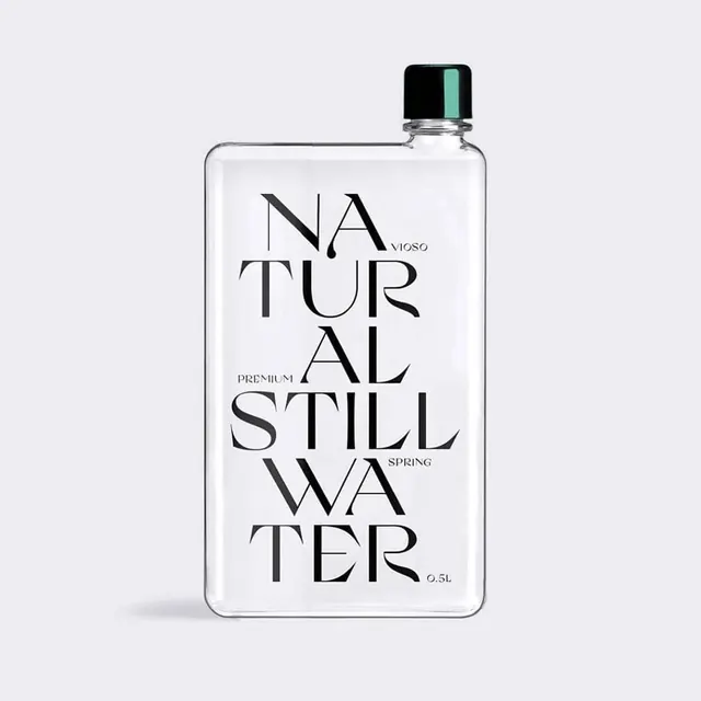
A square glass bottle of premium natural still water with elegant serif typography on a white background and minimal mint-green cap accent.
Summary
A minimalist product shot of a square glass water bottle with elegant centered serif typography spelling out "Natural Still Water" and "Premium/Spring" small text, accented by a small mint-green cap detail.
Visual description
A square, flat-bottomed glass bottle is centered on a near-white background. Large serif typeface runs down the center of the bottle's label, with "Natural" and "Spring" positioned above and below the primary copy. The word "Premium" appears in smaller serif letters. A black cap with a single mint-green accent stripe sits at the top. The minimal design creates a high-contrast, luxurious aesthetic against the light background.
Key takeaway
Ultra-minimal packaging design that relies on typography and generous whitespace to convey premium quality. The serif letterforms elevate perception, and the single color accent (mint green) provides sophistication without visual clutter. The square bottle form itself communicates modernity and intentionality.
Reuse notes
Ideal reference for luxury beverage, skincare, or wellness brands targeting discerning audiences. The monochromatic approach works particularly well when the product itself (clear liquid) is a visual asset. The serif typography choice grounds it as elevated rather than trendy. Works on both minimalist brand websites and high-end retail environments.
More like this


Keep what you find
A free account saves references to boards and can send you a weekly email of picks based on what you save.
To see every result, go Pro.