Preview image. Unlock full-res
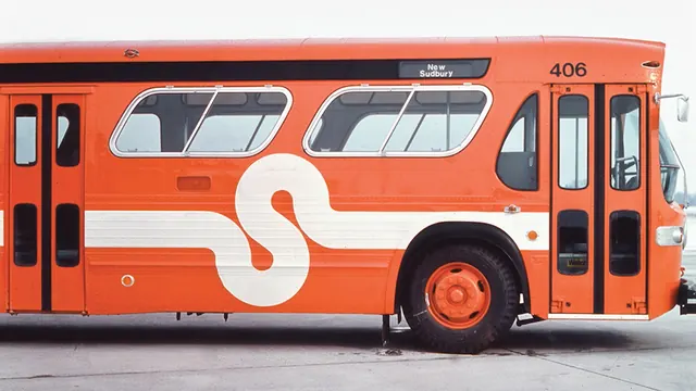
A side-profile photograph of a classic orange and cream subway or public transport bus featuring a large S numeral and route marker.
Summary
A classic public transport bus rendered in warm orange and cream, featuring bold geometric typography and vintage transit signage that exemplifies mid-century design and wayfinding.
Visual description
A vintage orange and white subway or public transit bus is shown in crisp side profile against a neutral gray sky. The body is split horizontally: brilliant burnt-orange upper section with windows featuring white frames and gray interior, light cream lower section. A large, bold white sans-serif "S" is prominently displayed on the middle section, accompanied by what appears to be a route or destination marker. Multiple vertical window divisions with dark interior shadows create rhythmic geometry. A "New Sudbury" destination sign appears on top. Dark wheels visible in profile ground the composition. The overall aesthetic captures mid-20th century transit design with its assertive color blocking and sans-serif numerical communication.
Key takeaway
The effectiveness of bold color contrast and oversized typography in transit and wayfinding design. The large S functions simultaneously as branding, route identifier, and decorative anchor that humanizes the vehicle.
Reuse notes
Strong reference for transit design systems, retro branding, vintage aesthetic projects, and any communication requiring bold, accessible typography at scale. Pairs well with circular color palettes and geometric forms. Ideal for transportation companies, vintage-inspired hospitality brands, or heritage-focused cultural institutions. The duotone palette is highly adaptable to different brand colors while maintaining visual impact.
More like this





Keep what you find
A free account saves references to boards and can send you a weekly email of picks based on what you save.
To see every result, go Pro.