Preview image. Unlock full-res
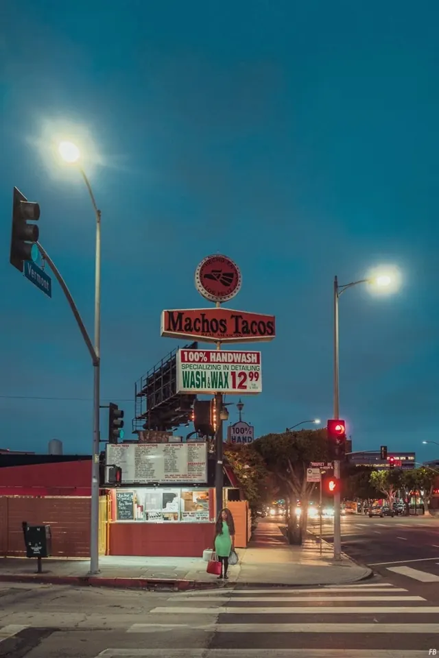
A vintage-style diner sign for "Machos Tacos" illuminated at twilight against a teal sky, featuring classic neon and marquee lettering.
Summary
A twilight photograph of a classic mid-century diner sign advertising Machos Tacos, combining red neon, illuminated marquee, and vintage metal construction against a deepening teal sky.
Visual description
The sign dominates the frame, mounted on a red brick storefront. A large circular red neon sign glows at the top. Below: "Machos Tacos" in bold red and white metal letters, "100% HANDWASH" and price signage on a white marquee panel. A smaller "100% HAND" sign is visible below. Street lamps and traffic lights frame the scene. The sky has shifted to deep teal in the magic hour, creating high contrast with the warm neon glow. The foreground shows street pavement and a figure in green waiting at a crosswalk, adding human scale.
Key takeaway
The power of vernacular signage as brand identity. Neon + marquee typography creates visual hierarchy and warmth that reads clearly even in dusky light. The retro aesthetic is not ironic—it's authenticity—and that sincerity resonates in contemporary design. Color temperature contrast (warm neon vs. cool sky) intensifies both.
Reuse notes
Essential reference for restaurants, bars, and casual brands embracing retro/Americana aesthetics. The layered signage (neon + metal + marquee) creates visual richness without looking cluttered. Useful for learning how transparency (neon) and opacity (metal letters, marquee) interact. Modern brands using retro styling should study this: it works because it's real, not a pastiche. The human figure adds context and scale—important for environmental photography.
More like this

Keep what you find
A free account saves references to boards and can send you a weekly email of picks based on what you save.
To see every result, go Pro.