Preview image. Unlock full-res
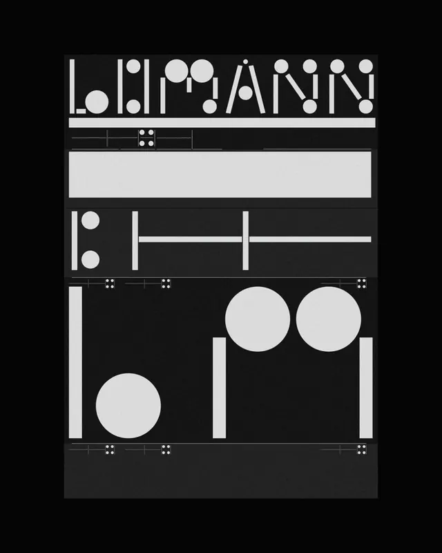
Minimal typographic study featuring single letters positioned at the corners of a white rectangle on pure black background, creating a geometric branding concept.
Summary
An ultra-minimalist geometric composition using four single capital letters positioned at the corners of a white rectangle, set against pure black.
Visual description
Pure black background with a centered white rectangular frame. At each corner, single letters in sans-serif: "P" (top-left), "A" (top-right), "L" (bottom-left), "M" (bottom-right). The letters read as a word when read clockwise from top-left. The white rectangle serves as the containing plane; the letters mark its boundaries. Extreme contrast and geometric precision dominate the visual language.
Key takeaway
Letters can serve as both content and structure. Corner placement creates a frame and implies continuation. High contrast with geometric precision communicates sophistication and clarity. Negative space (the black field) is essential to the design's impact.
Reuse notes
Strong conceptual approach for identity systems, packaging, or installation work that needs to convey minimalism and precision. The corner-letter strategy works well when the letters spell out or encode information. Effective for modern architecture, technology, or editorial applications seeking intellectual rigor.
More like this


Keep what you find
A free account saves references to boards and can send you a weekly email of picks based on what you save.
To see every result, go Pro.