Preview image. Unlock full-res
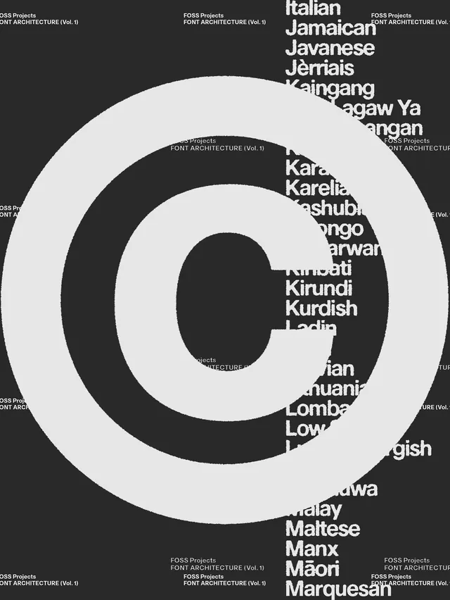
A monochromatic type specimen poster showing language names in white serif typography arranged in concentric circles against a dark background.

Summary
A striking black-and-white type specimen poster featuring white serif language names (Italian, Jamaican, Javanese, etc.) arranged in three concentric circles, showcasing font architecture and linguistic diversity.
Visual description
Pure high-contrast composition: black background, white typography. Large concentric circles divide the composition into rings. Within and around the rings sit language names in a clean serif display typeface: Italian, Jamaican, Javanese, Jèmais, Kaingang, Tagaw Ya, Pangan, Karо, Karelia, and others continuing outward. The text sizes vary subtly, creating a focal hierarchy. "FOSS Projects / FONT ARCHITECTURE (Vol. 1)" text repeats in the margins. The arrangement is geometric and mathematical—pure Swiss grid typography at its most restrained. The contrast is absolute, with no gradation or texture.
Key takeaway
Concentric circular hierarchy applied to a type specimen. The geometric arrangement transforms a catalog into visual poetry. The consistent serif typeface demonstrates unity while the language name variety shows breadth. High contrast and pure monochrome create maximum legibility and impact.
Reuse notes
Strong reference for type foundries, publishing, and identity systems that need to showcase diversity (languages, weights, scripts) in a unified visual system. The concentric grid is memorable and scalable. Works for datasets that benefit from circular organization. Requires a strong, legible typeface to succeed. Could pair with a secondary color in accent areas without losing impact.
More like this







Keep what you find
A free account saves references to boards and can send you a weekly email of picks based on what you save.
To see every result, go Pro.