Preview image. Unlock full-res
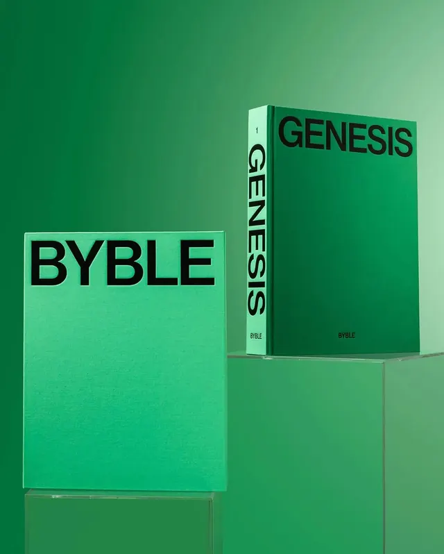
A vibrant green color palette study showing BYBLE brand books and packaging against a monochromatic green background.

Summary
A striking product photography shot of BYBLE brand books arranged on a matching green background, showcasing a cohesive green color palette through minimal composition and bold typography.
Visual description
A single-color green background fills the entire frame, creating a monochromatic aesthetic. Two BYBLE branded books sit on the ground: a lighter mint-green book with bold black "BYBLE" lettering and a darker forest-green hardcover titled "GENESIS" with vertical text on the spine. Both book spines show the "BYBLE" branding. The composition is symmetrical, with books positioned left and center, casting subtle shadows. The lighting is even, emphasizing the color variations within the green palette and the tactile quality of the book covers.
Key takeaway
Extreme color discipline—using a single color family for both background and product creates a sophisticated, unified look. The near-monochromatic approach makes the subtle palette variations (from mint to forest green) feel deliberate rather than accidental. Typography carries the visual hierarchy.
Reuse notes
Perfect for luxury brands or book/publishing design that wants to emphasize color palette work. The single-hue approach works best with products that have strong typographic or structural details (like the spine text here). Can feel austere—pair with richer typography or softer textures for warmth. Good reference for brand identity photography.
More like this








Keep what you find
A free account saves references to boards and can send you a weekly email of picks based on what you save.
To see every result, go Pro.