Preview image. Unlock full-res
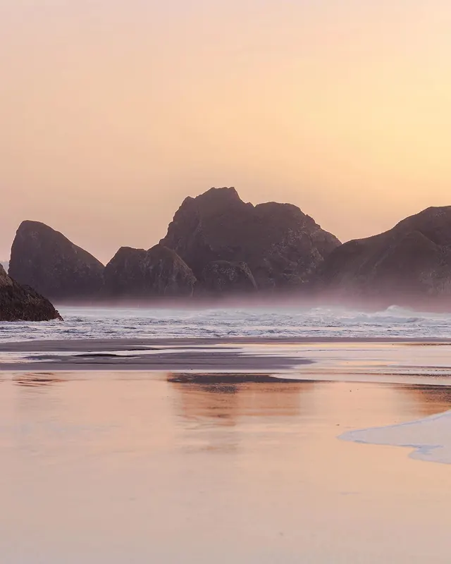
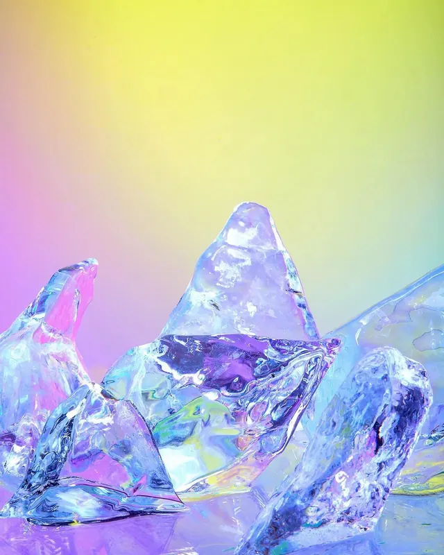
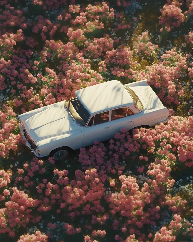
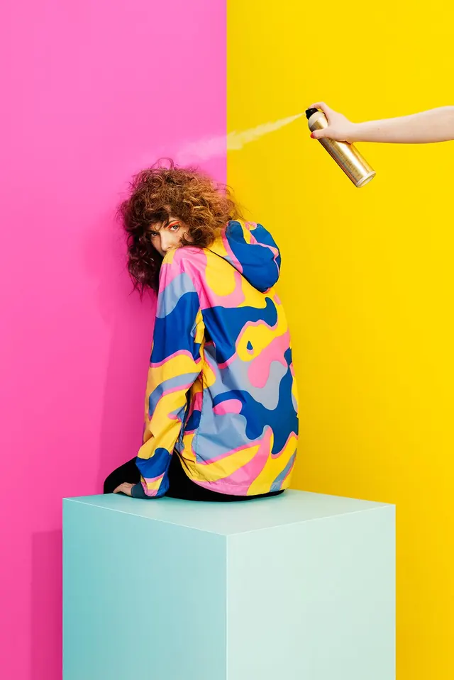
A portrait composition with warm pink, yellow, and deep navy accents creating a vibrant, balanced color palette.
Summary
A portrait photograph combining warm pastels with a striking deep navy anchor, creating visual depth and balance through complementary color zones.
Visual description
The composition is dominated by warm pinks and peach tones, with a bright yellow accent providing energy. A deep navy blue grounds the piece, while deep rose tones add richness. The color distribution is approximately 40% warm pink, 24% golden yellow, 20% navy, and 16% deep rose—a confident palette that leverages warm-cool contrast.
Key takeaway
The combination of warm pastels (pink, peach) with a single cool, dark anchor (navy) creates sophistication without coldness. This color strategy works well for portrait work, beauty branding, or editorial layouts that need warmth with structural grounding.
Reuse notes
Ideal for portrait photography, wellness branding, or editorial spreads seeking an inviting yet refined mood. The yellow accent is essential for preventing the palette from feeling too soft—it brings vibrancy. Works well in contexts seeking approachability with elegance.