Preview image. Unlock full-res
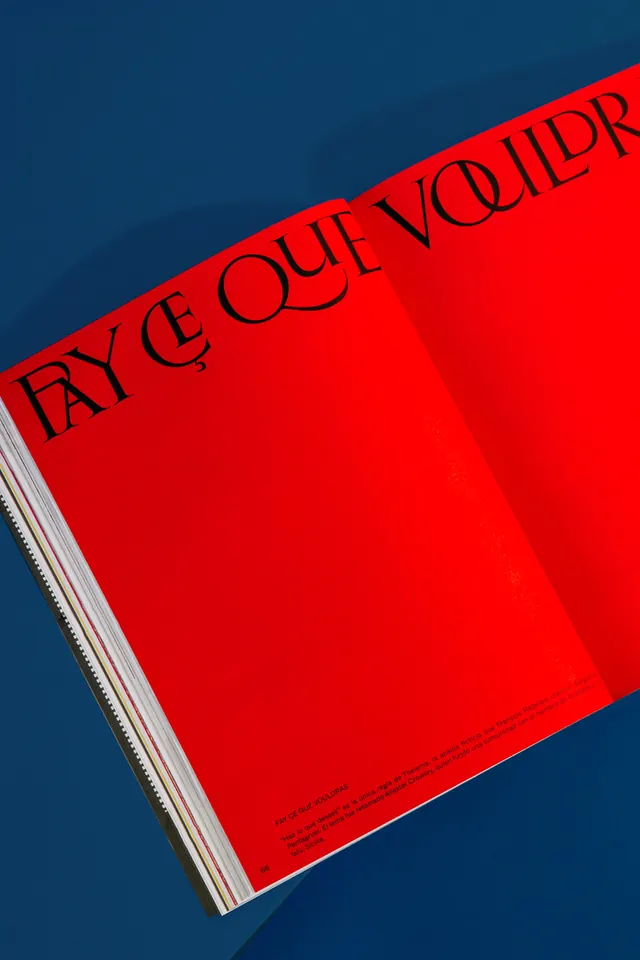
Bold editorial design featuring a bright red magazine cover with black serif typography on a deep navy background, emphasizing high-contrast geometric composition.
Summary
Bold editorial design featuring a bright red magazine cover with black serif typography on a deep navy background, emphasizing high-contrast geometric composition.
Visual description
A striking editorial magazine cover exploiting dramatic color contrast: a bright red diagonal plane against a deep navy background. Bold black serif typography reads "FAYE QUE VOIR" (or similar) positioned diagonally across the red cover. The geometric composition uses the diagonal orientation to create dynamic visual tension. White pages visible at the spine add a subtle accent. This design demonstrates the power of limited color palettes and strong typographic hierarchy in editorial design.
Key takeaway
The effective use of color, composition, and typography to create visual impact and communicate intention clearly.
Reuse notes
Reference this design when seeking inspiration for similar mood, color approach, or composition style. Works well in contexts requiring bold visual statements or professional, editorial aesthetics.
More like this









Keep what you find
A free account saves references to boards and can send you a weekly email of picks based on what you save.
To see every result, go Pro.