Preview image. Unlock full-res
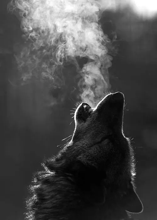
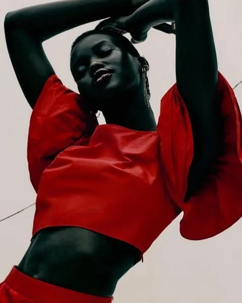
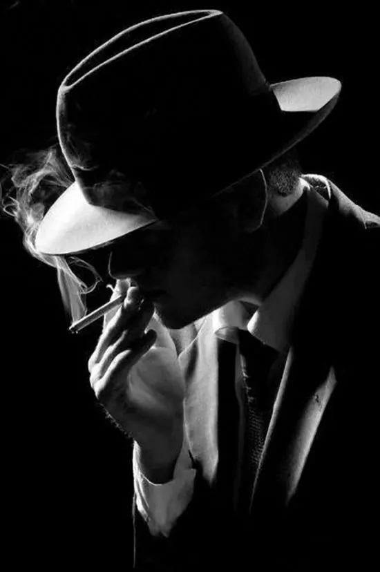
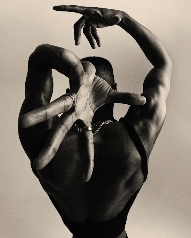
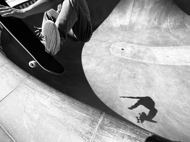
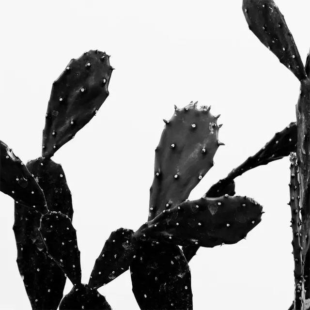
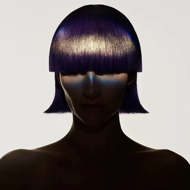
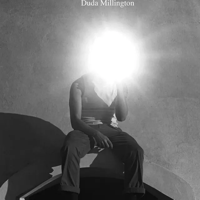
A high-contrast black and white composition with nearly perfect tonal balance between dark and light areas, emphasizing form and contrast.
Summary
A striking black-and-white composition with near-perfect tonal balance, using high contrast to emphasize form, texture, and dramatic visual impact.
Visual description
The palette is divided almost equally between deep black/dark gray (50%) and light gray/off-white (48%), creating a balanced yet dramatic contrast. This near-perfect 50/50 split suggests a carefully composed photograph where the artist has used contrast as a primary compositional tool. The vertical format (1.5:1) and significant collection engagement (21 sets) indicate this is a professional portrait work emphasizing dramatic lighting and form.
Key takeaway
The power of monochromatic contrast: by eliminating color entirely, the composition forces focus on form, light, shadow, and composition itself. The near-equal balance between dark and light creates visual equilibrium while maintaining dramatic impact.
Reuse notes
Excellent for artistic, editorial, and premium brand applications. The stark black-and-white treatment conveys sophistication, drama, and artistic intent. Ideal for fine art photography, editorial design, and brands seeking a bold, premium aesthetic. The high contrast reads well at any scale and prints beautifully. Works particularly well for portfolios, galleries, and design-forward brands. The monochromatic approach is timeless and never feels dated.