Preview image. Unlock full-res
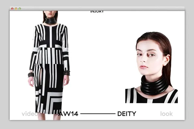
Minimalist composition with near-equal division between light beige and dark gray or warm brown tones, emphasizing subtle color play and balance.
Summary
Balanced minimalist composition using near-equal areas of off-white and very dark gray, with subtle warm brown undertones creating sophisticated visual equilibrium.
Visual description
The composition is roughly divided in half between a lighter off-white or cream region (approximately 52%) and a deep near-black area (approximately 45%). A subtle warm brown or taupe accent comprises the remaining 3%, serving as a gentle tonal bridge. The composition feels deliberately balanced and considered, with clean geometric division and no extraneous detail.
Key takeaway
Perfect balance between light and dark creates visual harmony and rest. Introducing a third subtle accent color prevents starkness while maintaining extreme restraint and sophistication.
Reuse notes
Ideal for minimalist, contemporary, or Scandinavian-influenced design. Works exceptionally well as a background or template for content overlay. The neutral palette suits professional, financial, or luxury brand applications. Strong for book covers, presentation slides, or architectural design contexts. Pairs perfectly with sans-serif typography. Flexible enough for both warm and cool accent colors to be added on top.
More like this









Keep what you find
A free account saves references to boards and can send you a weekly email of picks based on what you save.
To see every result, go Pro.