Preview image. Unlock full-res
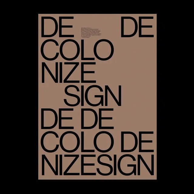
A typographic poster with large black sans-serif letterforms overlapping on a tan-beige background, reading "DECOLORIZE SIGN" and variations.

Summary
An editorial-style typographic poster with large geometric sans-serif text arranged in an overlapping, broken grid across a warm tan paper.
Visual description
Thick black sans-serif letterforms are arranged on a warm beige background in a deliberate but off-grid composition. The text reads "DE COLO NIZE SIGN" split and repeated, with words breaking mid-letter and repositioning around the page. A small body of gray text sits in the upper portion, likely small print or footnotes. The negative space and overlapping create visual complexity while maintaining legibility. The color contrast—deep black on warm neutral—is high. The layout feels both structured (clear hierarchy) and deconstructed (broken lines and unexpected breaks).
Key takeaway
How breaking text across space and letting it overlap creates visual interest while maintaining readability. The asymmetric arrangement feels contemporary and editorial.
Reuse notes
Use as a reference for posters, book covers, editorial design, and gallery materials. The approach of taking a coherent message and fragmenting it spatially works when you need both impact and sophistication. Best suited for contexts where a second read reveals the full message.
More like this






Keep what you find
A free account saves references to boards and can send you a weekly email of picks based on what you save.
To see every result, go Pro.