Preview image. Unlock full-res
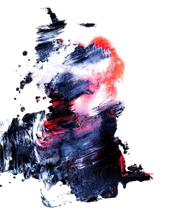
An expressive ink or paint composition featuring navy blue strokes, pink-coral accents, and white negative space creating gestural abstraction.
Summary
An abstract composition of loose ink or paint gestures in deep navy, hot pink-coral, and touches of red, layered on white paper creating organic rhythm.
Visual description
Bold, gestural brushstrokes dominate a white paper ground. Deep indigo-navy marks flow across the surface in curved, deliberate sweeps. Hot pink and coral strokes overlay and intersect, creating tension between cool and warm. Splatter and organic edges suggest speed and spontaneity. Larger areas of pure white remain untouched, allowing breathing room. Smaller accents in red punctuate the composition. The marks have varying opacity—some translucent, some opaque—suggesting media layering. No symmetry, no precision; the power lies in the gesture and the color choices.
Key takeaway
How bold expressive gestures and unexpected color pairings (deep cool blue with hot pink-red) create visual energy and movement. The restraint of leaving white space is as important as the marks.
Reuse notes
Use as reference for editorial illustration, art direction, album cover design, and any context needing expressive energy. The cool-warm color dynamic is particularly effective. Works in fashion, music, and lifestyle branding contexts. The technique emphasizes mood over message, making it ideal for conceptual rather than literal projects.
More like this
Keep what you find
A free account saves references to boards and can send you a weekly email of picks based on what you save.
To see every result, go Pro.