Preview image. Unlock full-res
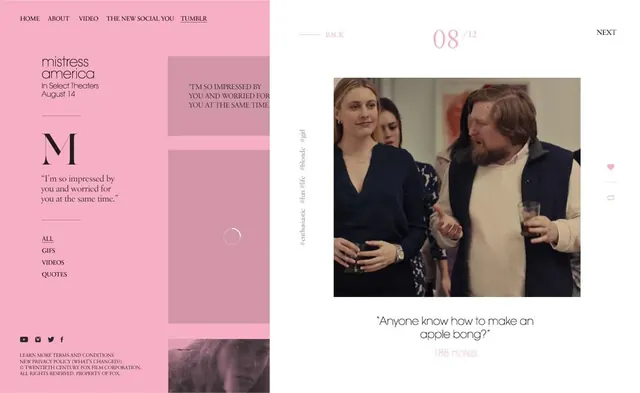
A film promotion website with a hot-pink left sidebar and center panel featuring typography and quote, a film still on the right with navigation overlay.
Summary
A visually bold website design promoting a film, using a hot-pink left sidebar, centered typography block, and a large film still image anchoring the right half.
Visual description
A three-column layout fills the frame. On the left: a hot magenta-pink sidebar with navigation (Home, About, Video, etc.), movie title "Mistress America", theatrical release date, and a large serif "M" initial. Center: cream background with quote text and call-to-action links (All, Gifs, Videos, Quotes). Right: a film still showing three actors, overlaid with metadata (date counter "08 / 12", navigation "NEXT", and a heart icon). The pink is saturated and uncompromising, dominating perception. Typography mixes serif and sans-serif. The layout prioritizes image and color over symmetry.
Key takeaway
How a single bold accent color (hot pink) becomes a brand tool when applied consistently across UI elements. The asymmetric three-column layout balances image-heavy and text-heavy zones.
Reuse notes
Strong reference for entertainment or arts promotion websites, especially film. The pink-on-white approach works for cultural or boutique brands targeting younger audiences. The divided layout (sidebar + content + hero image) is reusable across many contexts. The playful energy comes largely from the color choice, not the structure.
More like this

Keep what you find
A free account saves references to boards and can send you a weekly email of picks based on what you save.
To see every result, go Pro.