Preview image. Unlock full-res
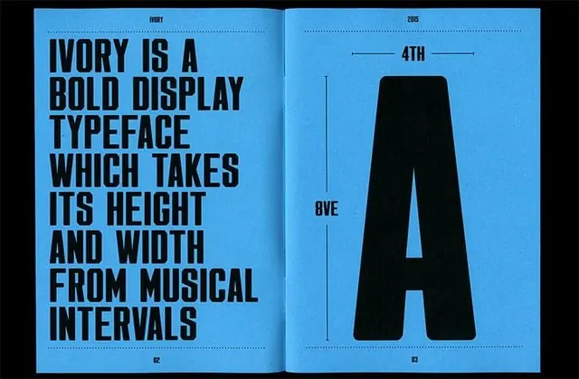
A photograph of printed typography reference pages showing typeface specimens and scales displayed against a vibrant bright cyan background.
Summary
Two facing printed pages of typography documentation shown on bright cyan background, featuring bold sans-serif display type and text about typeface design principles with letterform scales.
Visual description
Spread of two printed reference pages. Left page has all-caps text explaining a bold display typeface's construction principles referencing "musical intervals." Right page shows a single large "A" letterform with measurement annotations above and below, labeled with "4TH" and "8VE" (music interval references). Both pages use high-contrast black type and geometric guides on white/light background. Bright saturated cyan background intensifies the contrast.
Key takeaway
Typography specimens gain authority and clarity when presented with systematic measurements and spacing documentation. The experimental connection to musical intervals adds conceptual depth. Bold display type paired with technical diagrams creates legitimacy for unconventional design principles.
Reuse notes
Excellent for design system documentation, typeface marketing, or educational materials. The systematic approach validates experimental design choices. Works well for showing design process or type foundry materials. The bright background photography technique makes technical reference material engaging and shareable on social platforms.
More like this






Keep what you find
A free account saves references to boards and can send you a weekly email of picks based on what you save.
To see every result, go Pro.