Preview image. Unlock full-res
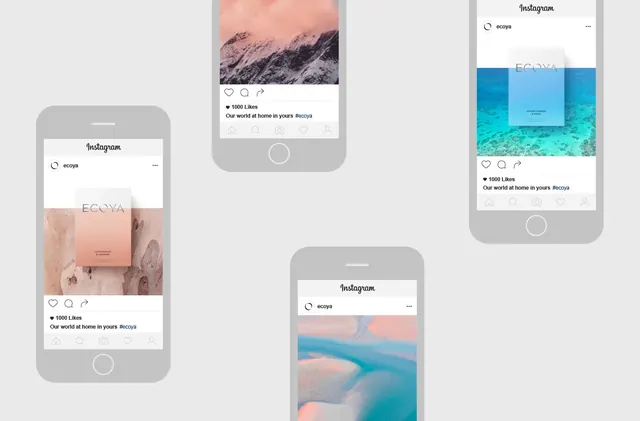
Interior or product photography featuring a restrained palette of warm earth tones and muted blues creating a calm, designed aesthetic from a New Zealand design studio.
Summary
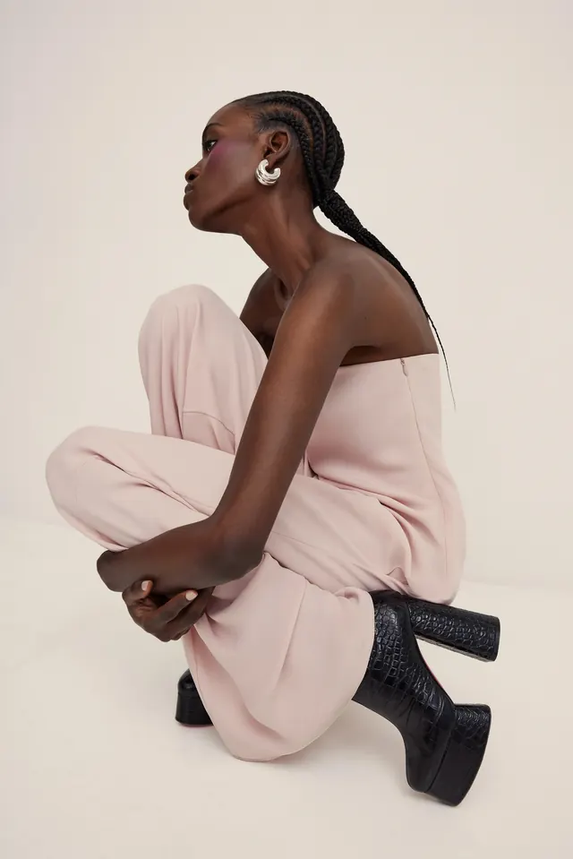
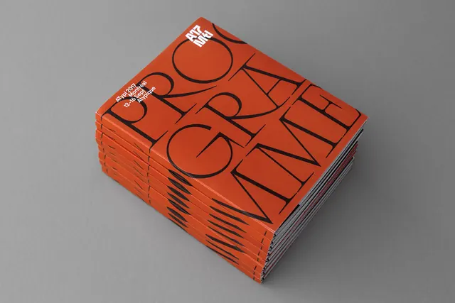
A carefully composed interior or product photograph demonstrating sophisticated color restraint. A warm beige (#E6E2E1) anchors the composition, accented by muted teal (#3D99AD), mauve (#876B6B), and soft blue (#8CA9B8) for depth and visual interest without chaos.
Visual description
Landscape orientation (1440x948px) suggests environmental or product photography. The palette is intentionally limited to four colors, creating a cohesive, designed feeling. Warm light and cool accents balance each other. The colors feel earthy yet contemporary—natural without being raw. Composition likely emphasizes form and light over busy detail.
Key takeaway
Restraint in color creates sophistication and legibility. The interplay of warm and cool within a muted palette creates visual interest without loudness. This approach is professional and timeless, suitable for high-end interior, luxury product, or design-focused editorial work.
Reuse notes
Ideal for luxury interior design, high-end furniture, or design studio portfolios. The palette works well in minimalist and contemporary contexts. Pairs beautifully with sans-serif typography and generous white space. The color balance (warm-cool) prevents the design from feeling either too cold or too warm, making it versatile for various applications from print to digital.
More like this

Keep what you find
A free account saves references to boards and can send you a weekly email of picks based on what you save.
To see every result, go Pro.