Preview image. Unlock full-res
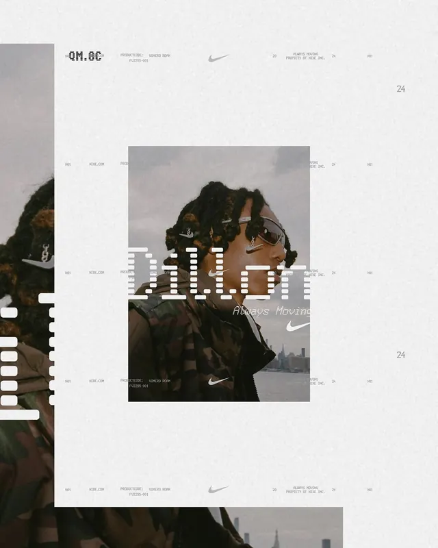
An editorial layout composition featuring photography, typography, and graphic elements arranged in an asymmetric collage style with Nike branding and "Always Moving" tagline.

Summary
An editorial campaign layout featuring a collage arrangement of lifestyle photography, bold sans-serif typography reading "ALWAYS MOVING," Nike branding, and structural graphic elements organized in an overlapping, asymmetric composition.
Visual description
The design uses a light beige background with layered photographic and typographic elements. A portrait photo of a person wearing Nike gear is positioned in the center, partially obscured by large blocky white typography spelling "ALWAYS MOVING." The Nike Swoosh logo and tagline "Always Moving" appear throughout. Color bars in neutral tones frame the left side. Additional photographic fragments and text elements reference "QM.OC" branding. Fine-lined graphic elements divide the composition into sections. The overall aesthetic combines modernist grid structure with editorial collage sensibilities.
Key takeaway
The power of layering and asymmetric composition in campaign design—how overlapping text, imagery, and graphic elements create visual dynamism while maintaining a unified brand narrative through consistent typography and color.
Reuse notes
Reference for Nike-style athletic brand campaigns, editorial layouts, and lifestyle advertising. Works for campaign conceptualization, lookbook design, and high-fashion/sports brand communications.
More like this


Keep what you find
A free account saves references to boards and can send you a weekly email of picks based on what you save.
To see every result, go Pro.