Preview image. Unlock full-res
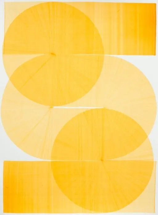
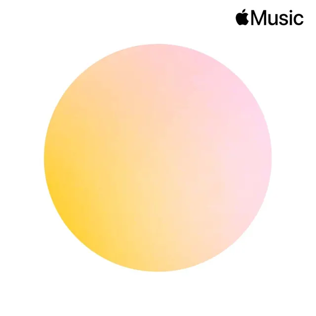
UI design study for Apple Music playlists featuring predominant warm beige (86%) with gold accents (11%) and dark text in a 1:1 square format.
Summary
A warm, minimalist UI design study for an Apple Music playlists interface, dominated by soft beige (86%) with golden accents (11%) and minimal dark text in a 1:1 square format.
Visual description
Square UI design (1000x1000px) featuring a warm color palette dominated by soft peachy-beige background (approximately 86%), complemented by golden/yellow tones (11%) serving as accent colors, with minimal dark charcoal text elements. The palette creates a warm, inviting interface suitable for music or media applications.
Key takeaway
Demonstrates effective use of warm, minimal color palettes in interface design. The balance between dominant background and accent color creates visual hierarchy without contrast fatigue.
Reuse notes
Excellent reference for app design, music streaming interfaces, or warm-toned UI systems. The beige-and-gold palette is trending in contemporary app design and feels approachable and premium. Square format is ideal for app mockups or social media promotion.