Preview image. Unlock full-res
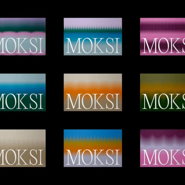
A 3x3 grid of smooth horizontal color gradients showcasing a single wordmark across contrasting color transitions, from cool teals and blues to warm oranges and pinks.
Summary
A 3x3 grid of horizontal gradient panels, each carrying the same wordmark "MOKSI" in white serif/display type across nine contrasting smooth color transitions (teal, orange, magenta, blue-gold, pink, green, etc.).
Visual description
Nine equal-sized horizontal rectangles arranged in a 3-column grid on a pure black background. Each panel features a smooth left-to-right gradient transitioning between two or more vibrant colors: teal fading to pink, orange to gold, blue to pale yellow, magenta to purple, cream to olive, blue to orange, magenta with subtle wave texture at the top, and others. The word "MOKSI" appears in white sans-serif/display typography, centered on each gradient, maintaining consistent placement and scale across all nine variations. Some gradients have subtle noise or wave patterns rendered at the top edge, adding texture without disrupting the color flow. The black frame isolates and dramatizes each color combination.
Key takeaway
The systematic approach to testing a single wordmark across a vibrant color palette, revealing how serif letterforms read against different color temperatures and saturations. The use of smooth gradients instead of flat blocks creates movement and visual interest in what could be a static specimen. The black background creates maximum contrast and makes each gradient feel distinct.
Reuse notes
Excellent reference for brand color systems, design tokens, or typographic scales that need to be validated across multiple color states. Works as both a design-system specimen and a web-design inspiration showing how to make color exploration feel intentional rather than decorative. Most effective when the wordmark or logotype can carry the visual weight across the color shifts.