Preview image. Unlock full-res
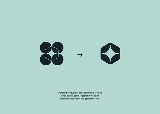
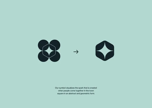
A minimalist icon design showing the abstraction and refinement of a four-circle motif into a streamlined hexagonal form.
Summary
A minimalist icon system showing the refinement of a four-circle composition into a geometric hexagon, demonstrating symbol simplification for design systems.
Visual description
Left side shows four dark navy circles arranged symmetrically with a centered light highlight and connecting line geometry. A rightward arrow leads to a simplified hexagonal form on the right, same dark navy with the light diamond/star center preserved. Background is a soft, cool mint-green. Below sits explanatory text in dark navy sans-serif, small and centered, describing the symbol's conceptual meaning. The entire composition is balanced and centered, emphasizing the before-and-after geometric transformation.
Key takeaway
The side-by-side before-and-after format clearly demonstrates design reduction. The use of negative space and a single directional arrow makes the refinement narrative unmissable. Mint-and-navy duotone creates visual interest without complexity.
Reuse notes
Strong reference for icon system documentation, design process slides, or brand guideline covers. Works well to show how rough geometric forms simplify into usable symbols. The soft mint background keeps it friendly and approachable despite the technical content.