Preview image. Unlock full-res
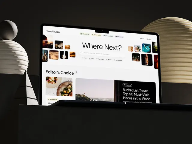
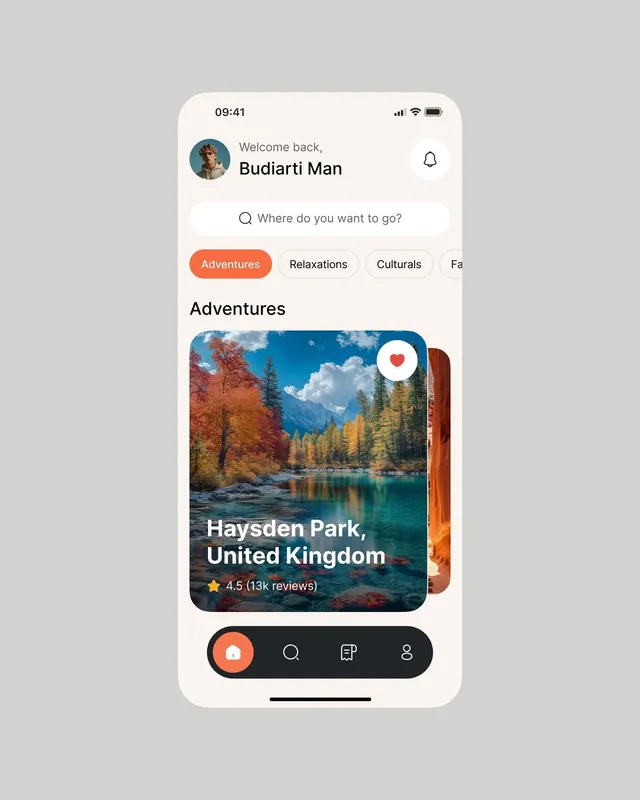
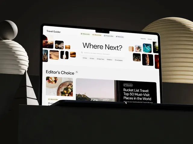
Travel booking interface layering oversized typography over a rich photographic mosaic, using earthy neutrals and teal accents to organize destination content.
Summary
Travel guide app interface layering a bold "Where Next?" headline and navigation over a rich mosaic of destination photography, anchored by curated editorial content cards.
Visual description
White background with a structured two-column layout. Left side shows a grid of travel photography in varied aspect ratios (landscapes, portraits, abstracts) with minimal spacing. The center anchors a large black sans-serif headline "Where Next?" with a search input below, followed by location badges (Paris, Cairo, Cape Town, Mexico, Los Angeles) in a row. Right side mirrors the left with more photography. Below the fold appears an "Editor's Choice" section showing a food dish, a castle landscape, and a dark card with "Bucket List Travel" headline in white type on a teal background.
Key takeaway
The mosaic photography grid establishing visual narrative without captions; the oversized headline cutting through the image field as a typographic focal point; subtle accent color (teal) applied sparingly on feature cards to redirect focus from the ambient imagery.
Reuse notes
Strong template for travel, lifestyle, and destination-discovery apps. Requires a rich, varied photo library to feel genuine. The color palette translates well to food, real estate, and editorial contexts where photography carries the storytelling.