Preview image. Unlock full-res
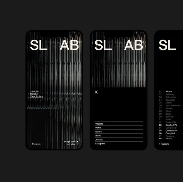
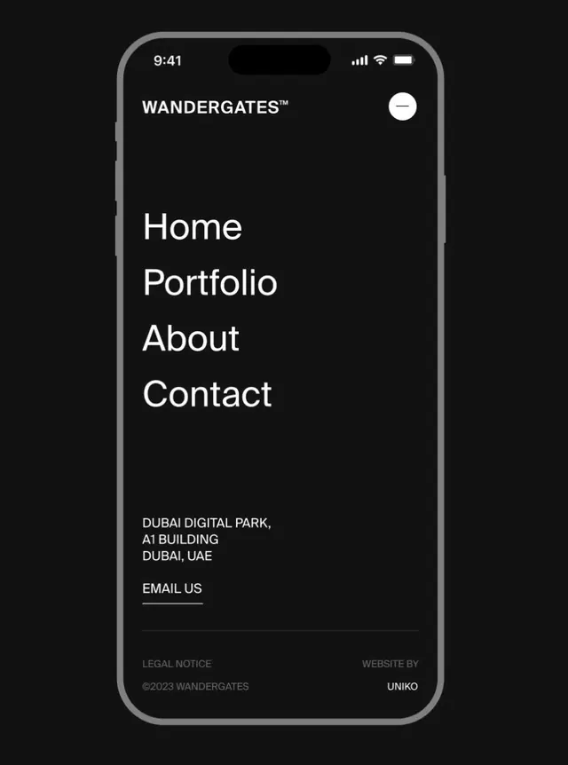
A mobile-first dark-mode menu interface featuring minimalist sans-serif navigation and contact details for a luxury portfolio brand.
Summary
A mobile-first dark-mode menu interface featuring minimalist sans-serif navigation and contact details for a luxury portfolio brand.
Visual description
A mobile phone mockup with pure-black background shows a vertical stacked layout. At the very top: "WANDERGATES™" in white sans-serif, right-aligned with a small white menu toggle icon top-right. Below: four left-aligned navigation items ("Home", "Portfolio", "About", "Contact") in large, bold, white sans-serif with tight line spacing. Generous whitespace separates navigation from a bottom section containing address text in light gray ("DUBAI DIGITAL PARK, A1 BUILDING DUBAI, UAE"), a divider line, and an underlined "EMAIL US" label. The footer shows copyright, "LEGAL NOTICE" in smaller gray text, and "WEBSITE BY UNIKO" on the right. The entire aesthetic is monochromatic and elegantly sparse.
Key takeaway
The vertical isolation of navigation items (no containers, no visual separation) lets the white text float on black and draw heavy visual weight. The bottom-anchored contact block creates a clear footer without a styled container. The consistent left-alignment for primary content and right-alignment for secondary (menu icon, "WEBSITE BY") reinforces a clean information hierarchy.
Reuse notes
Perfect template for portfolio or luxury brand mobile experiences. Dark backgrounds make light sans-serif shine and feel premium. The generous line-height on navigation keeps the design from feeling cramped even at a small scale. Works best with a strong geometric or humanist sans-serif; avoid serif or script.