Preview image. Unlock full-res
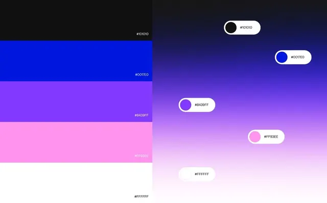
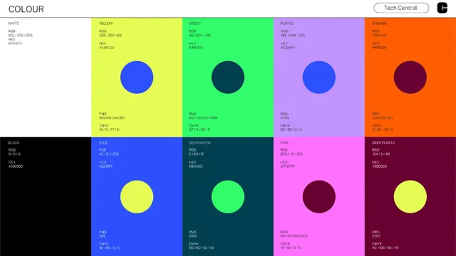
Design system color specification document showing vibrant color blocks with RGB/HEX/CMYK values and contrast-validation circles embedded in each swatch.
Summary
A design system color palette reference showing eight saturated color blocks in a grid, each displaying technical specifications (RGB, HEX, CMYK values) and an embedded contrast-validation circle demonstrating pairing legibility.
Visual description
Against a white background, a 4x2 grid of large, saturated color blocks organizes the palette: bright yellow, neon green, vibrant purple, and orange in the top row; pure blue, deep teal, hot pink, and deep purple in the bottom row. Each color block spans roughly equal width and height. Within each block sits a large circle in a contrasting color: the bright yellow block contains a blue circle, the green contains a dark teal, purple contains blue, orange contains deep purple, blue contains yellow, teal contains lime, pink contains deep purple, and the deep purple contains yellow-green. Black header labels sit above or to the left of each swatch, listing the color name (YELLOW, GREEN, etc.) and technical data: RGB values, HEX codes, and CMYK percentages in a monospace font. Top right corner displays "Tech Central" in a pill-shaped button. The leftmost column includes additional swatch rows for BLACK, and secondary reference colors.
Key takeaway
Embedding contrast circles directly in each color block shows accessibility validation at a glance. Technical specs (RGB, HEX, CMYK) in monospace type make the reference useful to developers and designers alike. The grid layout with equal-sized blocks reads as systematic and professional. Saturated, high-contrast colors signal that this is a digital, modern system.
Reuse notes
Use as a design system reference document or brand color specification sheet. Pairs well with typography samples and component libraries. The contrast circles are particularly useful for validating WCAG pairings. Works for digital-first brands and SaaS systems. If used in presentations, the bold colors may benefit from reduced opacity on dark slides to maintain legibility.