Preview image. Unlock full-res
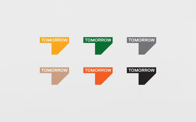
A brand color-swatch sheet presenting one geometric logo mark -- a stepped rectangular T-shape with the word TOMORROW -- in six distinct colorways on a neutral gray ground.
Summary
A brand identity color-exploration sheet showing one stepped geometric logo mark in six colorways -- amber, dark green, mid gray, tan, orange-red, and black -- arranged in a 2x3 grid on a pale neutral ground.
Visual description
The image is a wide-format white-gray background with six identical logo units arranged in two rows of three, each unit spaced evenly with generous breathing room. The mark itself is a compact geometric shape: a rectangular block at the top-left with the word "TOMORROW" set in tight, bold, condensed all-caps white sans-serif, and an angled lower-right extension that creates a stepped or tab-like silhouette (suggesting a stylized T or a folded corner). Each of the six instances is solid-filled in a different brand color: top row is amber/yellow, forest green, and medium gray; bottom row is tan/beige, orange-red, and near-black. The background is a uniform very light warm gray. No supplementary text, labels, or captions appear on the image.
Key takeaway
The uniform grid layout for color-variant sheets is immediately readable -- same form, six fills, no distraction. The condensed all-caps wordmark set directly into the mark (rather than beside it) makes each swatch self-contained at any size. Choosing six perceptually distinct hues (warm, cool, neutral, dark) rather than tints of one color shows the mark's versatility across contexts clearly.
Reuse notes
Use as a reference for presenting logo color variants in pitch decks, brand guidelines, or client approval sheets. The 2x3 grid works for four to six variants; beyond six, consider switching to a horizontal strip. The stepped/tabbed mark shape is distinctive but category-neutral, making it a good abstract-form reference for any brand that needs a logomark separate from the wordmark.