Preview image. Unlock full-res
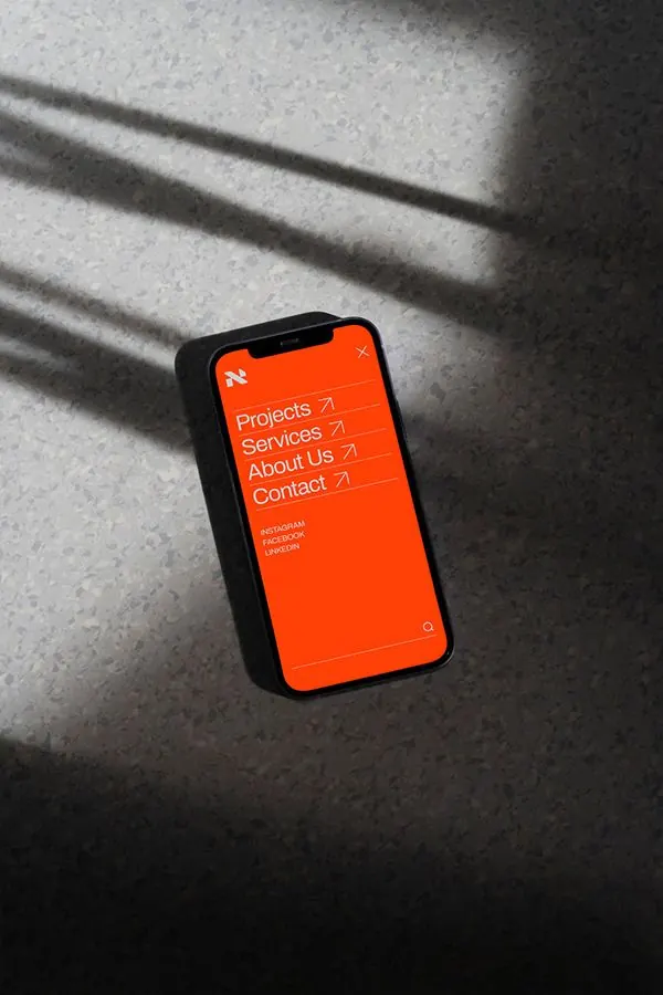
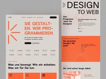
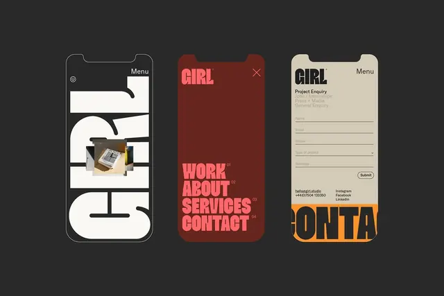
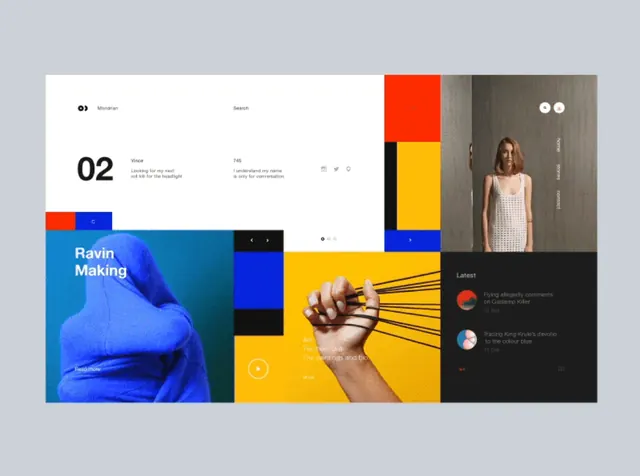
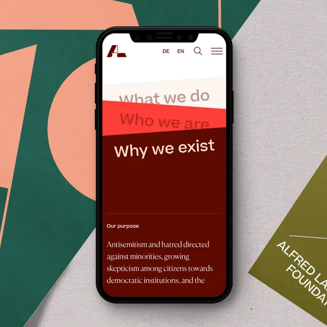
Mobile onboarding screen with three color-blocked navigation tabs and overlapping geometric shapes creating depth.
Summary
Mobile app screen showcasing organizational messaging through three distinct color-blocked tabs, with overlapping geometric shapes in the background creating visual depth.
Visual description
Vertical mobile phone frame with a stacked tab interface. Three horizontal tabs in deep teal, coral-pink, and burgundy-red display section headers: "What we do," "Who we are," "Why we exist." Below the selected tab is a content area on a cream background with organizational messaging. The background behind the phone features overlapping geometric shapes in earthy tones (teal arcs, coral triangles, olive accents) that frame the device. Clean sans-serif typography in white and dark text. The layout emphasizes strong color separation and clear hierarchical organization.
Key takeaway
The color-blocked tab system creates visual rhythm without borders or underlines, each section feeling self-contained yet cohesive. The geometric background composition adds visual interest without interfering with the functional UI. The warm-to-cool color palette (coral against teal) provides natural contrast.
Reuse notes
Effective for nonprofit, NGO, or organizational websites that need to present multiple value propositions or departments. Works well when sections have distinctly different messaging. The geometric background technique pairs effectively with flat design but requires careful color selection to avoid overwhelming the UI.