Preview image. Unlock full-res
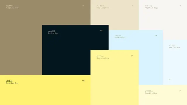
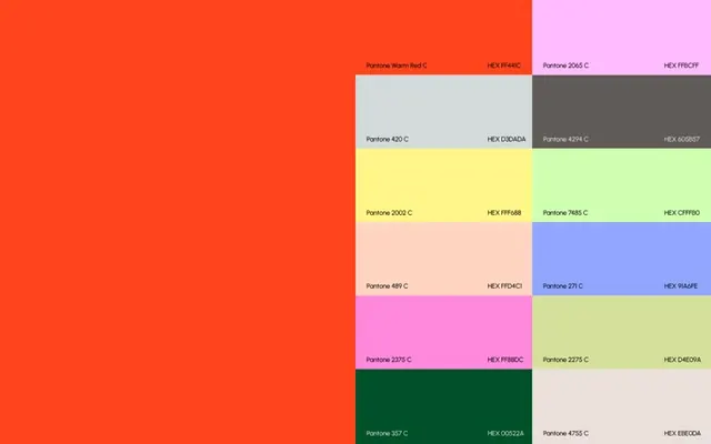
Reference palette grid displaying Pantone and hex color codes in a two-column layout spanning warm oranges, neutrals, yellows, pinks, blues, and greens.
Summary
Pantone color reference palette organized as a two-column grid with hex values, balancing warm oranges and reds on the left with cool pastels and brights on the right.
Visual description
Layout splits left-to-right: left side dominated by a large warm orange-red field (Pantone Warm Red C, HEX FF441E), right side a structured 4x3 grid of labeled color swatches. Grid includes light gray (Pantone 650C), pale mint green (Pantone 748C), pale yellow, soft pink, pale blue (Pantone 271C), bright lime green, deep forest green (Pantone 357C), and light neutral beige. Each swatch labeled with Pantone name and hex code in black or dark text. Predominantly flat design with no gradient or texture; colors remain distinct and cleanly separated.
Key takeaway
The split composition (large dominant color anchoring, refined grid opposite) creating visual balance without symmetry. Dual labeling system (Pantone + hex) useful for both print and digital workflows. Pastel-to-vibrant range on the grid side demonstrates coordinated system thinking.
Reuse notes
Strong starter for showing a curated brand palette alongside technical color specs. Use for design system documentation, product color standards, or mood-board references. The warm-heavy left presence can anchor a muted color story while the grid remains flexible for accents.