Preview image. Unlock full-res
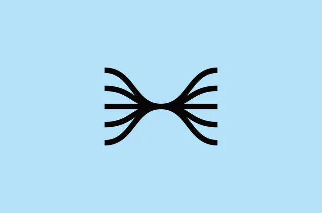
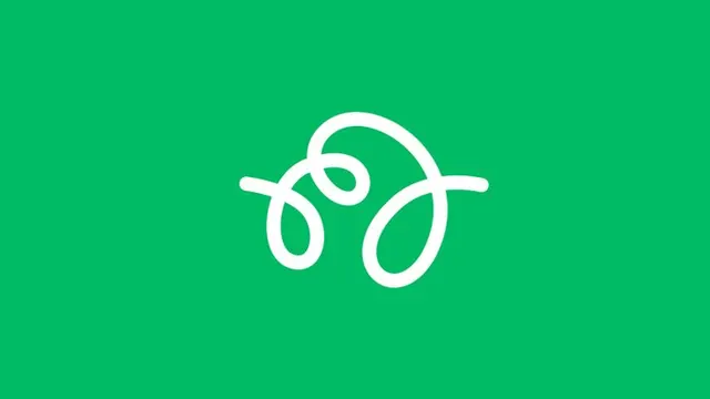
A single white abstract logo composed of interlocking curved lines forming a cyclical knot, centered on a bright green field.
Summary
A scalable mark logo combining three interlocking curved strokes in white, forming a continuous looping knot shape, rendered alone on a saturated green background.
Visual description
A single iconic mark centered in frame: three white strokes of consistent weight flow in and out of one another, creating a closed loop with no visible start or end. The curves are smooth and organic, suggesting motion or continuity. The geometry reads as both abstract (not a literal object) and vaguely suggestive (could evoke a leaf, a fingerprint, or interconnected paths). Bright kelly green background (#00BB64 or similar) creates extreme contrast with the white lines, making the mark legible at any scale. No text, no secondary elements. The construction is simple enough to work as an app icon or favicon, yet sophisticated enough for brand application.
Key takeaway
The use of continuous line-work (no enclosed shapes, no fills) to convey movement and complexity while staying minimal; the high-contrast green and white palette that makes the mark pop and memorable; the geometric-but-organic balance that feels modern without being cold or corporate; the design's scalability and clarity across sizes.
Reuse notes
Strong as a tech or developer-focused brand identity. The looping, connected-path concept pairs well with narratives about integration, continuity, or collaborative platforms. Works in app icon slots, favicon, and mark-only branded items. Could be paired with a geometric sans-serif. Green is assertive; consider the overall brand palette before reusing the exact hex.