Preview image. Unlock full-res
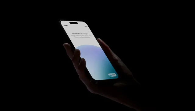
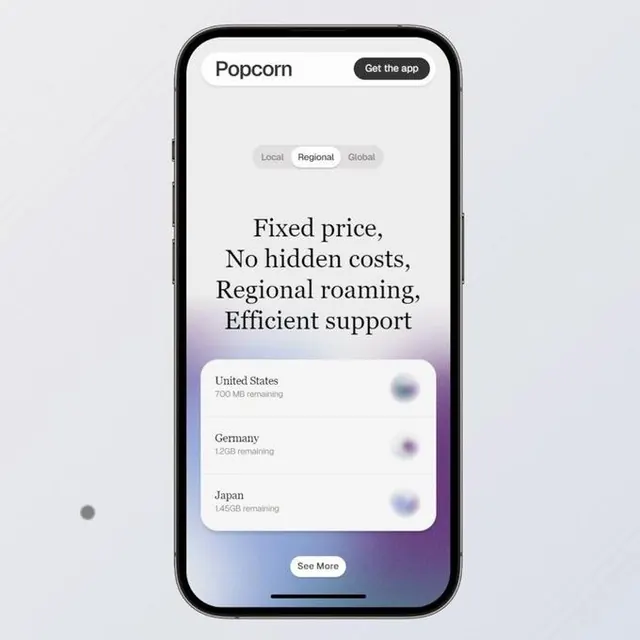
A mobile subscription interface with a white header, regional pricing toggle tabs, and a gradient footer transitioning from neutral to deep purple, displaying regional roaming plans with data allowances.
Summary
A vertical mobile pricing screen with a light header, segmented regional tabs (Local, Regional, Global), descriptive headline, stacked pricing cards listing data-plan details by country, and a footer gradient that deepens to dark purple.
Visual description
Displayed within a smartphone frame against a light background. The header houses the brand name "Popcorn" and a "Get the app" button. Below, three toggle tabs (Local, Regional, Global) appear in muted gray. The main content area displays a large, left-aligned sans-serif headline spanning multiple lines ("Fixed price, No hidden costs, Regional roaming, Efficient support"), followed by a rounded white card container holding three list items (United States, Germany, Japan) with data amounts and toggle switches aligned to the right. At the footer, a vertical color gradient transitions from neutral to violet-purple, with a "See More" button centered at the bottom of the viewport.
Key takeaway
The stacked card list with right-aligned toggle switches for compact information display. The regional tab hierarchy (Local / Regional / Global) as a quick segmentation pattern without page navigation. The gradient footer as a visual container closure that hints at expandable content. The typography hierarchy that leads the eye from headline to data details through scale and weight changes.
Reuse notes
Excellent reference for subscription, telecom, or fintech mobile onboarding and pricing screens. The toggle-switch pattern works well for binary on/off states or region selection. Works best when pricing information needs to feel trustworthy and scandal-free; the minimalist color palette (muted grays and deep purple) conveys professionalism. Gradient footer can feel dated in web applications but reads well on mobile.