Preview image. Unlock full-res
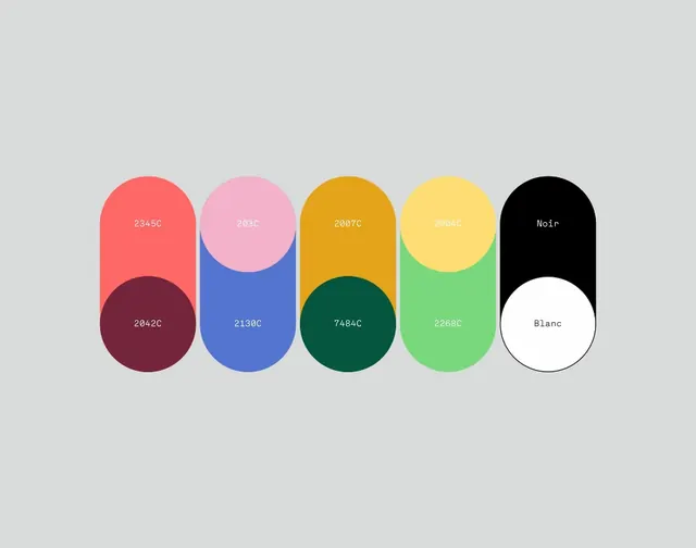
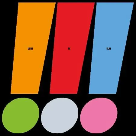
A high-contrast geometric composition of six color swatches arranged in a two-row grid: three angled vertical rectangles (orange, red, blue) above three circles (lime green, light gray, hot pink).
Summary
A minimal geometric composition showcasing six vibrant colors in two groups: three angled trapezoid/parallelogram shapes (warm and cool spectrum) above three circles (vibrant lime, muted gray, hot pink) on black.
Visual description
A solid black background framing six pure-color geometric shapes. Top row: three angled quadrilaterals tilted outward (orange/gold, bright red, sky blue), each labeled in small monospace type. Bottom row: three circles (lime green, light gray/silver, hot pink) with matching labels. The angled shapes suggest perspective and movement, while the circles below feel grounded and solid. No gradients, shadows, or texturing; all colors are flat and saturated. Typography is spare and centered within or below each swatch.
Key takeaway
The shape contrast between angled and circular elements creates visual rhythm. The warm-cool-warm-cool-warm-cool color sequence reads as a deliberate complementary study without needing explanation. High saturation and black background make each color pop distinctly, ideal for testing palette choices before implementation.
Reuse notes
Use as a mood board or swatch reference when exploring a bold, high-contrast brand palette. Pairs well with geometric or flat-design systems. The pure, unshadowed colors work for digital-only design; print may need CMYK adjustment. More suitable for energy-drink, gaming, or youth-focused brands than conservative corporate work.