Preview image. Unlock full-res
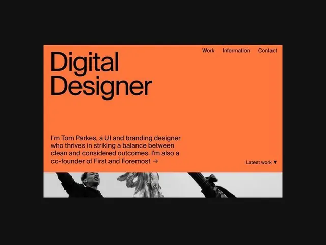
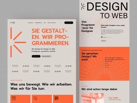
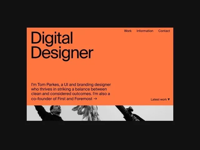
Portfolio site header with a burnt-orange hero block containing large sans-serif headline, descriptive bio, and top-right navigation, anchored by a grayscale photographic strip below.
Summary
Portfolio site header with a burnt-orange hero block containing large sans-serif headline, descriptive bio, and top-right navigation, anchored by a grayscale photographic strip below.
Visual description
The layout is horizontally centered within a black canvas. A burnt-orange rectangle occupies the main real estate. Inside, the left side holds a large, two-line sans-serif headline ("Digital Designer") in dark navy text. A paragraph of bio copy sits below in smaller, dark type, describing the designer's practice and naming collaborators. The top-right corner holds a horizontal navigation menu (Work, Information, Contact) in small sans-serif. Below and right-aligned is a "Latest work" label with a small downward arrow. The footer of the orange block transitions into a grayscale photographic strip showing three cropped human figures, creating a visual anchor and breaking the typographic focus. Black canvas surrounds the entire composition.
Key takeaway
The burnt-orange / black contrast is bold yet readable and feels editorial rather than corporate. The two-column interior layout (headline left, nav top-right) uses whitespace efficiently. Combining a sans-serif headline with a photographic footnote grounds the design in both typography and authentic human presence.
Reuse notes
Strong foundation for designer, creative agency, or freelancer portfolios. The orange-on-black works for warm, confident brands; substitute the color for cooler alternatives if the brand calls for it. The photo strip adds approachability without cluttering the hero. Pair with minimal supporting sections to maintain focus.