Preview image. Unlock full-res
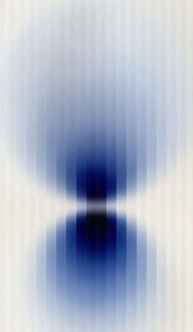
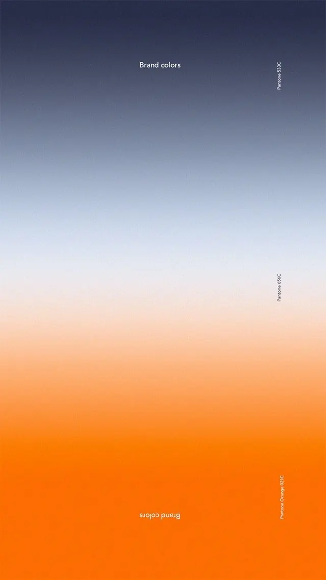
A branded color gradient progressing vertically from deep indigo at the top through pale blue and warm peachy-beige into vibrant orange at the bottom, labeled as a design system asset.
Summary
A single-color-axis gradient showing a curated palette progression from deep indigo through pale blue and warm neutrals to bright orange, presented as a color specification asset labeled "Pandora Design Color".
Visual description
Full-screen vertical gradient spanning from dark navy-indigo at the very top to vibrant burnt orange at the very bottom. The gradient transitions smoothly: indigo descends to soft pale blue (around the upper third), transitions through warm beige and peachy tones (middle), then deepens into warm orange tones (lower third). Text labels in white sans-serif appear centered horizontally in the dark region ("Brand colors") and vertically along the right edge ("Pandora Design Color") in two places. The entire composition functions as a single continuous color ramp without segmentation or discrete swatches.
Key takeaway
A single smooth gradient as a complete color system specification is reductive and memorable. The cool-to-warm transition path feels natural and shows contrast without feeling jarring. Labeling the gradient as a system asset (rather than background or decoration) positions it as a design tool, not a visual effect.
Reuse notes
Works as a brand color specification for design systems that value subtlety and progression. The gradient direction (cool to warm) reads as approachable and balanced. Use when you want to present a limited, refined palette to an audience or developer. The gradient works at full screen or as a component in a style guide. Too much contrast between dark top and bright orange bottom might cause eye strain on extended viewing.