Preview image. Unlock full-res
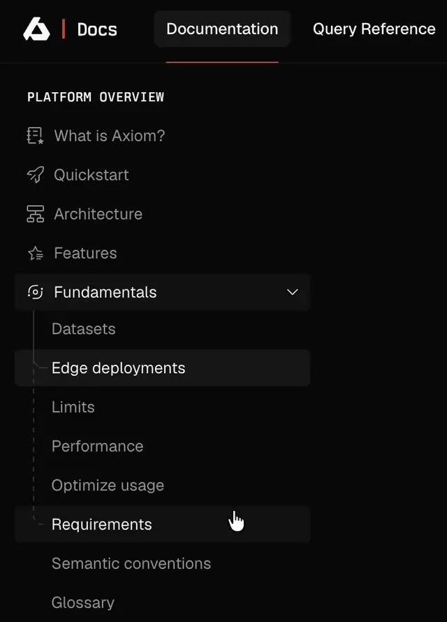
A dark-themed documentation sidebar for Axiom Docs showing smooth hover and active state transitions as the cursor navigates through expandable menu sections.
More like this
See all

Summary
A dark-themed documentation sidebar for Axiom Docs showing smooth hover and active state transitions as the cursor navigates through expandable menu sections.
Visual description
Dark interface with a documentation sidebar header showing the Axiom logo, 'Docs' label, and three tab options with an orange underline on the active 'Documentation' tab. The navigation list below contains top-level items (What is Axiom?, Quickstart, Architecture, Features) followed by an expanded 'Fundamentals' section with nested child items like 'Edge deployments' (visibly highlighted). Subtle icons precede each item.
Key takeaway
Use a highlight background on the currently hovered or selected nested menu item to make the active breadcrumb visually distinct while maintaining the hierarchy tree structure.
Reuse notes
Reach for this as a ui screen reference. Pairs with minimal, clean directions. Original by Gurbinder.