Preview image. Unlock full-res
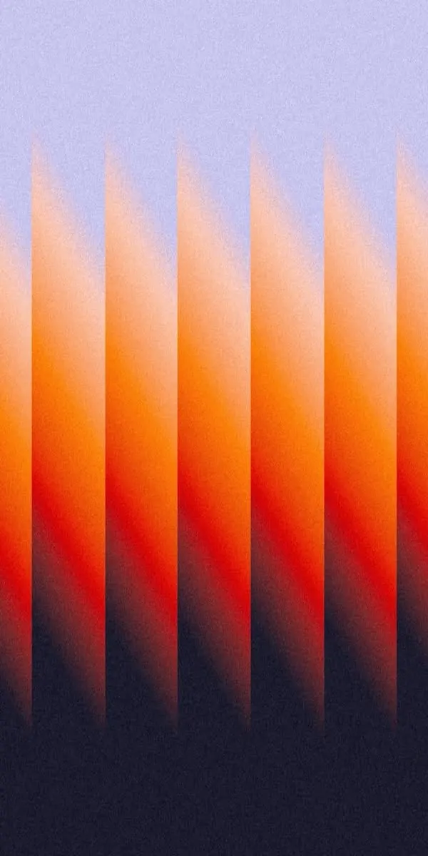
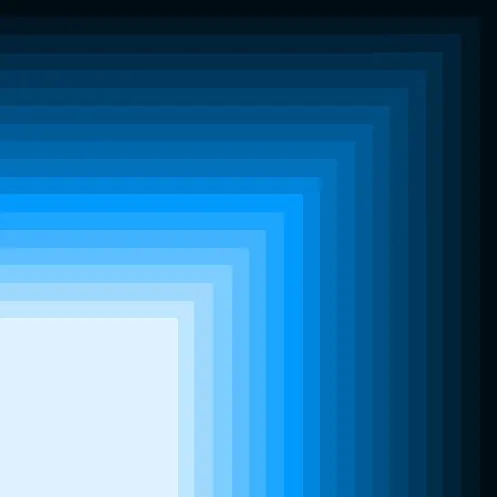
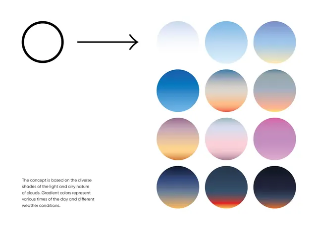
A visual system of 12 gradient swatches representing atmospheric light and sky conditions across a full day cycle, progressing from pale blues to warm sunsets to deep night tones.
Summary
A visual system of 12 gradient swatches representing atmospheric light and sky conditions across a full day cycle, progressing from pale blues to warm sunsets to deep night tones.
Visual description
A left-aligned outline circle with a rightward arrow leads to a 3x4 grid of filled circles on a light background. Each circle holds a radial or directional gradient. The top row shows pale-to-medium blues (dawn sky). The middle-left is vivid solid blue; middle-center fades orange-to-peach (sunset); middle-right is rose-to-lilac (dusk). The bottom row darkens into navy, slate, and near-black. A small annotation at bottom-left explains the concept references cloud light and weather variation. The composition is spare and systematic, treating color as the primary content.
Key takeaway
The stacked-gradient grid as a design-system reference or background-texture library. Each swatch is a complete, standalone gradient you could pull for UI backgrounds, text overlays, or atmospheric illustrations. The day-cycle progression gives the palette narrative logic beyond color theory.
Reuse notes
Useful for projects needing a cohesive set of atmospheric or sky-inspired gradients. Strong for wellness, weather, meditation, or time-tracking apps. Can also serve as a visual guide for mood and lighting consistency across a design system. Works well with minimal UI where gradients carry the entire aesthetic.