Preview image. Unlock full-res
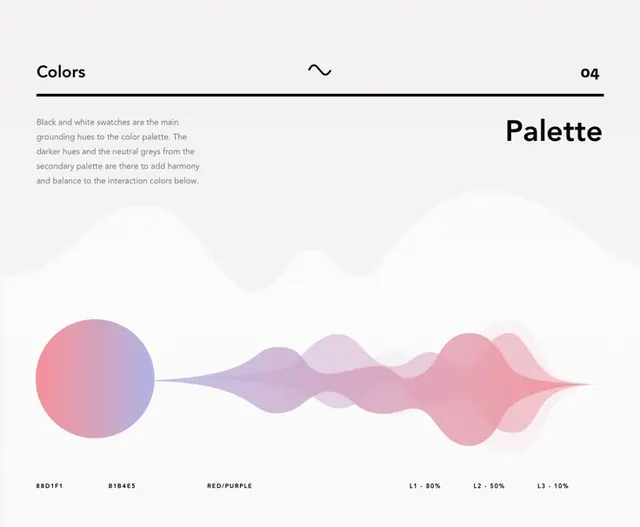
A design system color palette page featuring soft pink-to-lavender gradient forms with hex codes, demonstrating a muted, analogous color harmony against light background.
Summary
A design system color palette page featuring soft pink-to-lavender gradient forms with hex codes, demonstrating a muted, analogous color harmony against light background.
Visual description
Light off-white background with "Colors" section heading (top left) and page number "04" (top right) anchoring a horizontal composition. Left side: explanatory text in small gray sans-serif describing black/white groundings, darker secondary hues, neutral greys for harmony. Right side: bold "Palette" heading. Center: soft pink circle (anchor point) transitions into flowing organic wave forms that morph through mauve and pale lavender. Wave shapes have soft edges suggesting blended gradients. Below the forms: hex codes in all-caps sans-serif (#8D1F1, #D1B465, RED/PURPLE, L1-80%, L2-50%, L3-10%), labeling color values and lightness scale.
Key takeaway
The use of organic wave forms instead of color swatches to show gradation and harmony. Soft pastel analogous palette reads calm and sophisticated. The accompanying descriptive text anchors the visual form with clear information hierarchy. The page numbering and section structure suggest professional design system documentation.
Reuse notes
Ideal for design system documentation, brand guidelines, or color theory reference pages. The soft gradient approach is approachable for creative industries (design, marketing, agency). Works well as a secondary page in a longer guide. The minimal type treatment and ample whitespace pair well with high-end branding or editorial design work. May feel too delicate for technical or corporate contexts.