Preview image. Unlock full-res
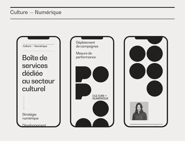
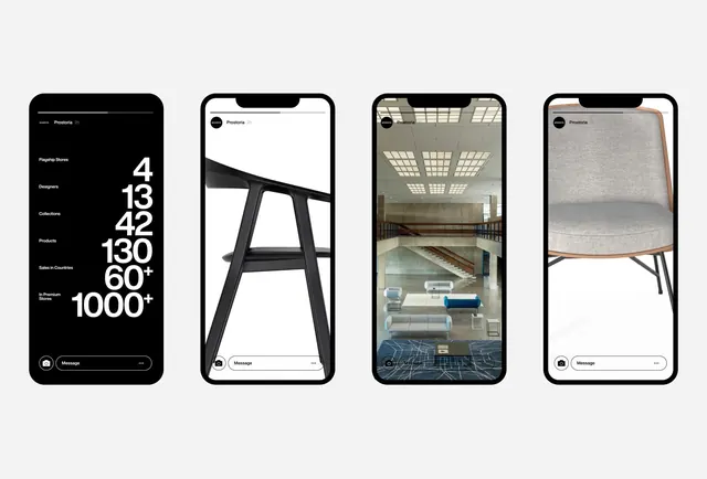
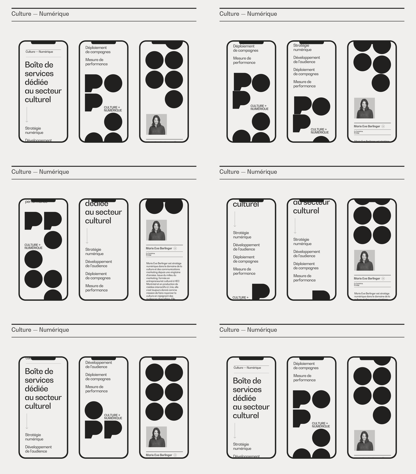
Three side-by-side mobile app mockups using a strict monochrome palette of white, black, and neutral greys with geometric hierarchy and ample whitespace.
Summary
Three vertical mobile mockups side by side using strict monochrome (black, white, and neutral greys) with geometric line hierarchies and commanding whitespace to establish cultural/digital service identity.
Visual description
Horizontal composition of three iPhone mockups separated by clean vertical spacing. Each phone displays a different screen: left screen shows a geometric grid-based layout with black typography labels on white; center screen features bold black headlines with smaller grey sub-copy and geometric dividers; right screen presents a more sparse composition emphasizing single focal text elements surrounded by negative space. All screens use consistent sans-serif weight hierarchy, consistent neutral palette, and avoid color entirely, relying purely on typography scale and geometric shape to organize information.
Key takeaway
Extreme constraint in monochrome creates refinement and trustworthiness. Geometric line elements (dividers, borders, grid lines) replace color as the visual organizer. The three-phone side-by-side comparison format efficiently shows state variety (list view, detail view, empty state).
Reuse notes
Ideal for apps serving cultural institutions, serious digital platforms, or corporate services where restraint signals expertise. Works well as a style guide reference showing tonal hierarchy without distraction. Pair with one accent color when moving to production; the monochrome works as a foundation, not final product.