Preview image. Unlock full-res
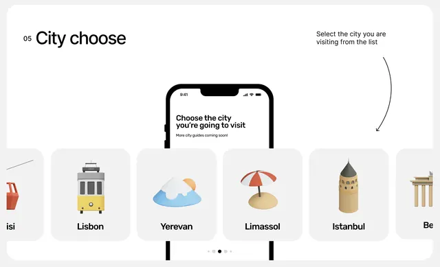
Mobile interface for destination selection, showing a scrollable card grid with city icons, labels, and a centered device mockup explaining the feature.
Summary
Mobile interface for destination selection, showing a scrollable card grid with city icons, labels, and a centered device mockup explaining the feature.
Visual description
A step labeled "05 City choose" anchors the top-left. A centered iPhone mockup displays the mobile flow: headline text ("Choose the city you are going to visit"), sub-copy, and instruction text. To the right is a right-aligned helper line and label ("Select the city you are visiting from the list"). Below, a horizontal scrolling grid of icon-based city cards, each containing a flat illustration (suitcase, clouds with sun, beach umbrella, tower, columns) and city labels (Lisbon, Yerevan, Limassol, Istanbul). Subtle visual elements at edges suggest scroll continuity. A clean gray and white palette with warm accent colors on the icons. Clean, sans-serif body and header type throughout. Plenty of whitespace around elements improves legibility and reduces visual clutter.
Key takeaway
Icon-plus-label cards in a horizontal scroll pattern are intuitive for mobile selection flows. Placing a device mockup center-stage with actual interaction context on both sides reduces cognitive load. The neutral palette with warm icon accents guides the eye without overwhelming. Generous spacing and clear hierarchy make the flow feel effortless, not cramped.
Reuse notes
Strong pattern for travel booking flows, city/region selection, or any multi-option flow on mobile. The icon approach scales well across many options. Works best when icons are recognizable and distinct. Consider this layout for onboarding, preference selection, or destination browsing in travel, food, or local-services apps.