Preview image. Unlock full-res
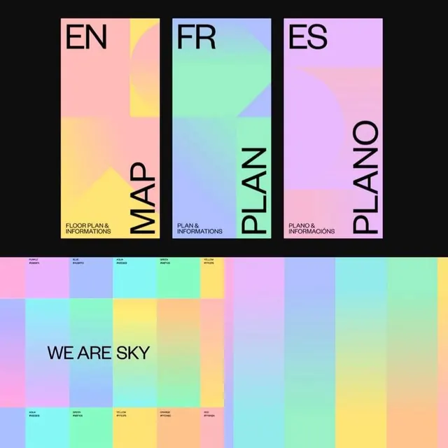
A wayfinding design system for a space called 'We Are Sky' featuring three language variants (EN, FR, ES) with soft pastel gradient color blocks and minimalist labeling.
Summary
A spatial design system showing three language versions of a floor plan layout (EN, FR, ES) with "We Are Sky" branding, rendered as distinct vertical panels above a continuous pastel gradient color reference grid.
Visual description
Top third shows three tall rectangular panels side by side, each with a distinct soft gradient fill: left panel (EN) fades pink-to-yellow; middle panel (FR) fades blue-to-cyan-to-green; right panel (ES) fades pink-to-purple. Each panel has minimal black typography: large condensed "LANGUAGE CODE" at top, vertical "PLAN" at right edge, and small "FLOOR PLAN & INFORMATIONS" label at bottom. Below the panels sits a dark band with small metadata labels. The bottom two-thirds displays a sprawling rectangular gradient color grid (about 5x5 blocks) in soft pastels: pinks, blues, cyans, yellows, peaches, mint greens. The grid has text labels at small scale marking color names or zones. Center text reads "WE ARE SKY" in large condensed sans-serif, overlaid on the gradient grid.
Key takeaway
Organizing spatial/navigational information as discrete vertical zones tied to language versions, then anchoring the whole system with a shared color palette grid below. Using soft, pastel gradients rather than flat colors suggests calm, human-friendly wayfinding. The large "WE ARE SKY" assertion at scale anchors the identity and spatial concept. The tight, minimalist labeling avoids clutter while maintaining clarity.
Reuse notes
Strong for architectural, museum, gallery, or institutional wayfinding systems. Works well for multilingual spaces where each language/region occupies distinct visual territory. The pastel palette reads as accessible and friendly rather than corporate. The color grid approach scales to larger, more complex venue maps.