Preview image. Unlock full-res
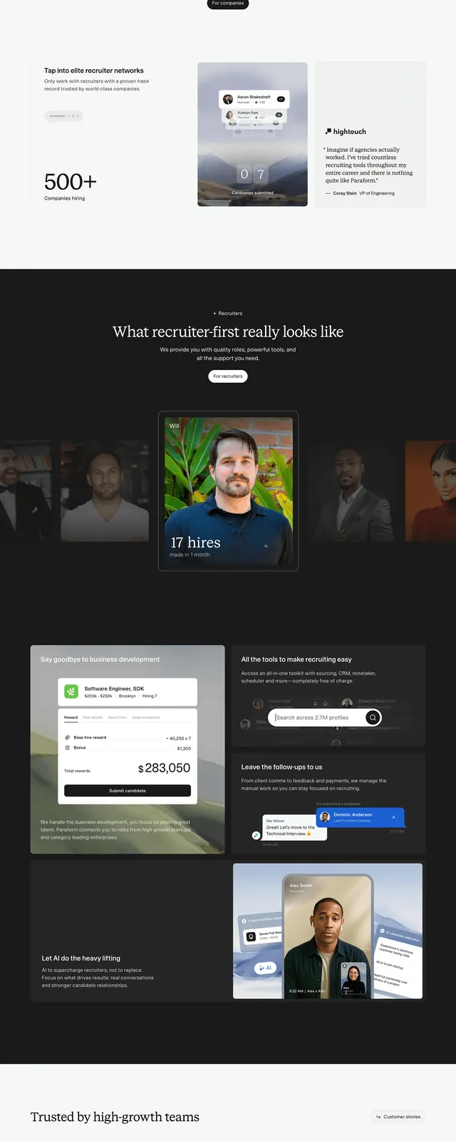
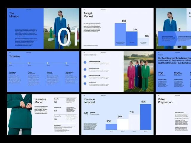
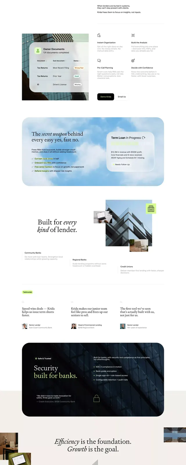
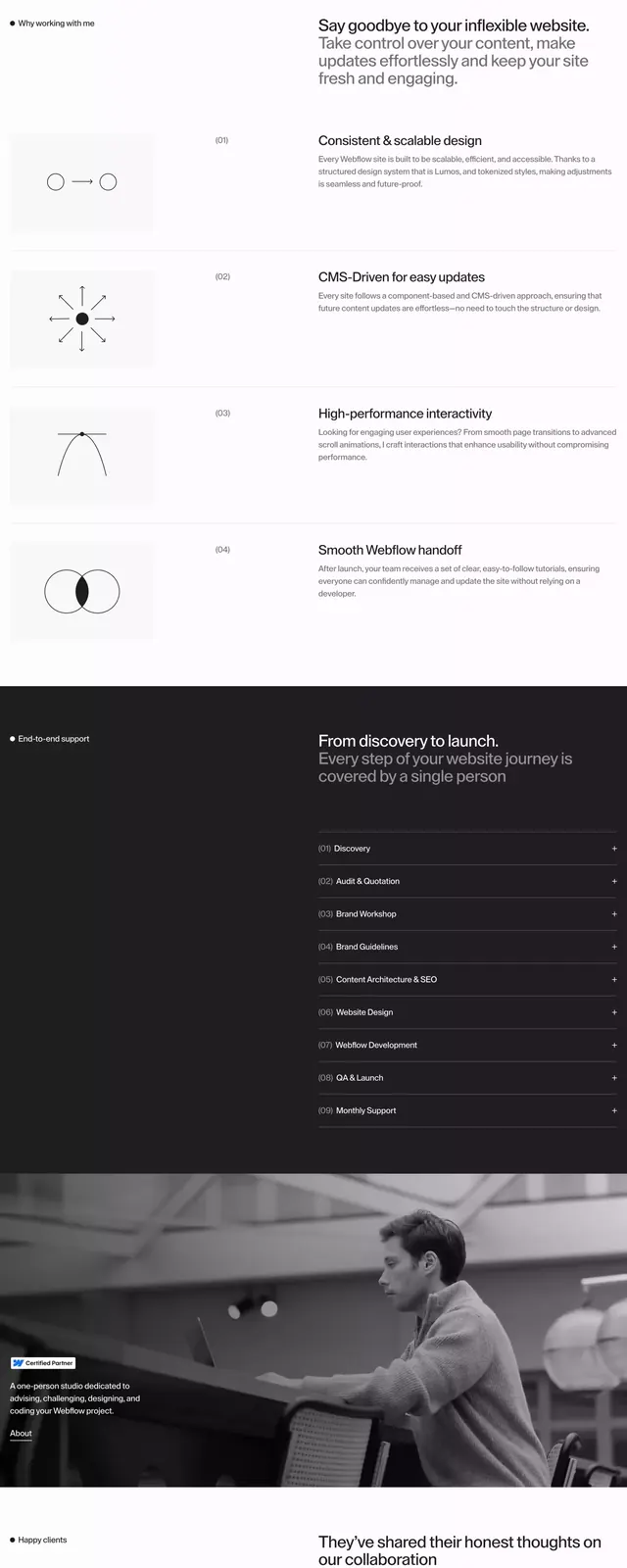
This design demonstrates a highly structured and minimalist visual language, emphasizing clarity through precise grid systems and restrained use of color.
Summary
This design demonstrates a highly structured and minimalist visual language, emphasizing clarity through precise grid systems and restrained use of color.
Visual description
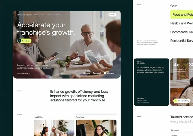
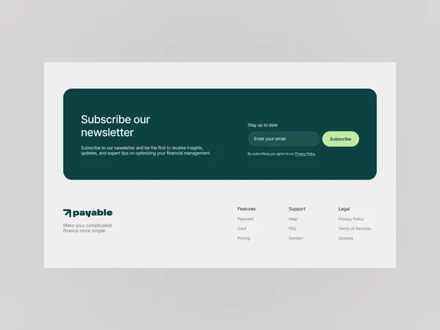
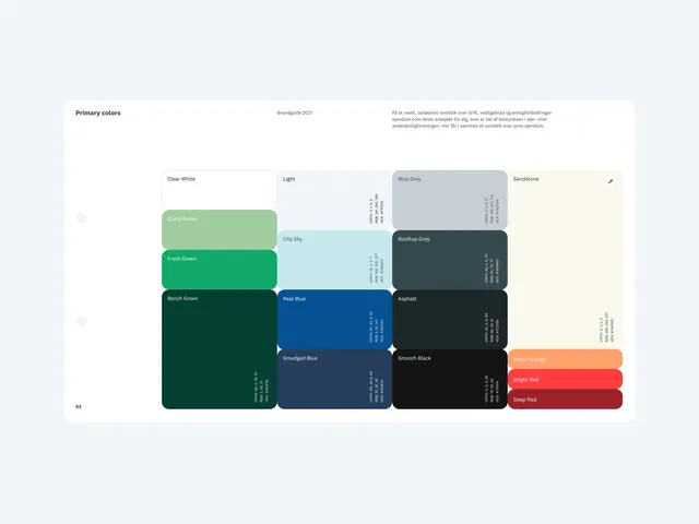
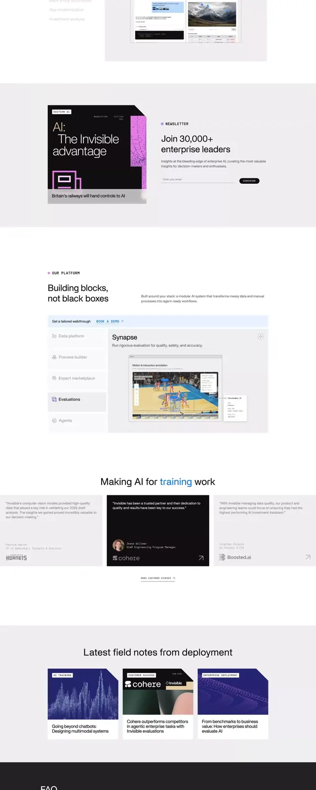
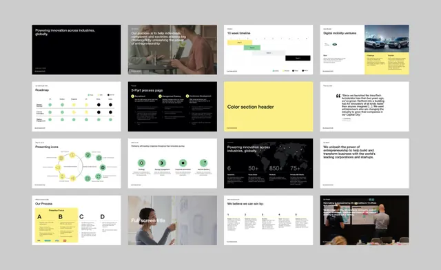
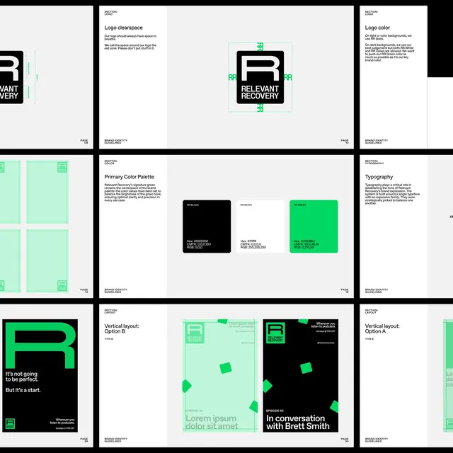
This design demonstrates a highly structured and minimalist visual language, emphasizing clarity through precise grid systems and restrained use of color. The style is professional, corporate, and focused entirely on providing a clean blueprint for branding elements. The composition relies heavily on clear separation, organized sections, and a balanced use of negative space to ensure visual hierarchy. Implied clean sans-serif fonts are used, prioritizing readability and a modern, functional aesthetic.
Key takeaway
An ui screen reference. Worth saving for its minimalist, corporate, structured treatment.
Reuse notes
Fits marketing work.