Preview image. Unlock full-res
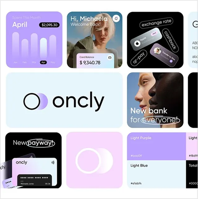
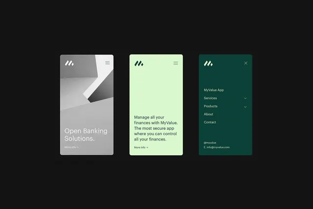
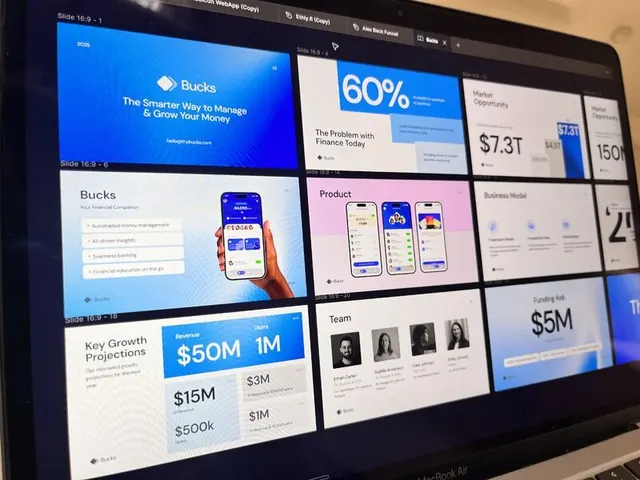
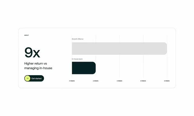
This screen demonstrates a highly functional and modern user interface for displaying financial data, emphasizing clarity and trust.
Summary
This screen demonstrates a highly functional and modern user interface for displaying financial data, emphasizing clarity and trust.
Visual description
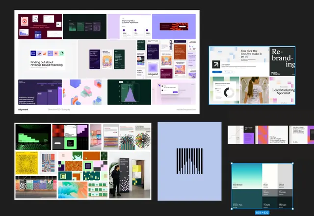
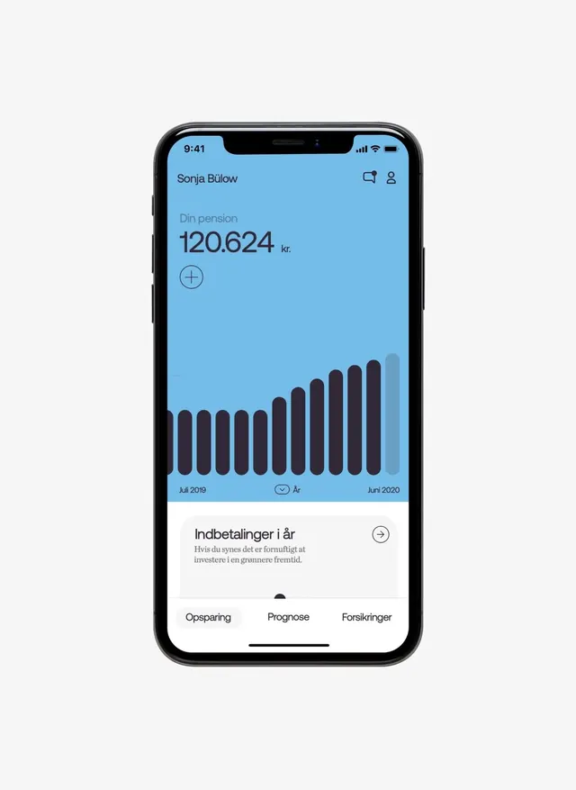
This screen demonstrates a highly functional and modern user interface for displaying financial data, emphasizing clarity and trust. The design effectively uses a clean color palette and strong data visualization to present complex information in an easily digestible format. The layout is structured logically, prioritizing the key metric and historical trends above navigational options. The composition is vertically organized, using ample white space to separate sections and ensure high readability for numerical data. A clean, legible sans-serif typeface is used throughout for optimal screen readability.
Key takeaway
A dashboard reference. Worth saving for its minimalist, fintech, data-driven treatment.
Reuse notes
Fits fintech work.