Preview image. Unlock full-res
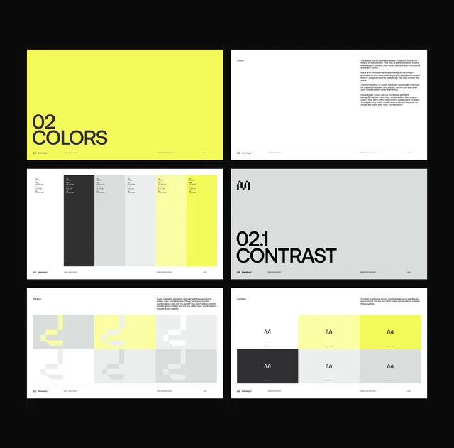
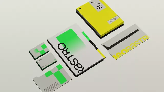
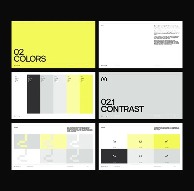
This design showcases a highly graphic and minimalist approach, relying heavily on stark high contrast between black/grey and vibrant yellow accents.
Summary
This design showcases a highly graphic and minimalist approach, relying heavily on stark high contrast between black/grey and vibrant yellow accents.
Visual description
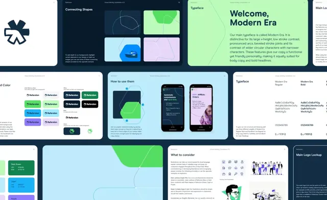
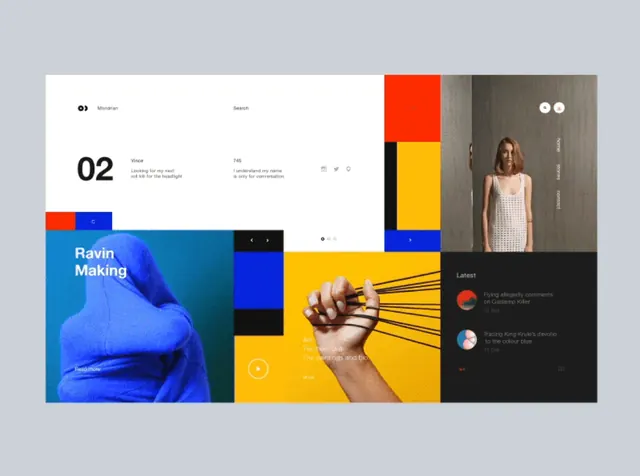
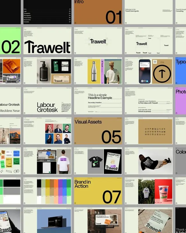
This design showcases a highly graphic and minimalist approach, relying heavily on stark high contrast between black/grey and vibrant yellow accents. The visual language is precise, utilizing strong geometric shapes and ample negative space to create a clean, modern, and professional feel. The presentation effectively demonstrates color theory and contrast principles for branding or UI development. The layout is dominated by grid systems and balanced segmentation, using solid blocks of color and defined boundaries to organize information. A clean, bold, sans-serif typeface is used throughout, emphasizing clarity and modernity.
Key takeaway
An ui screen reference. Worth saving for its minimalist, high-contrast, geometric treatment.
Reuse notes
Fits marketing work.