Preview image. Unlock full-res
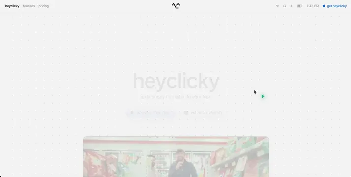
A playful and experimental landing page for Heyclicky, an AI desktop companion app, featuring a light background with scattered floating screenshots and embedded video demos.
Summary
A playful and experimental landing page for Heyclicky, an AI desktop companion app, featuring a light background with scattered floating screenshots and embedded video demos.
Visual description
A light, minimal landing page centers the product name in very pale grey typography with its tagline positioned below. Two faded download buttons sit in the mid-page, followed by a translucent rounded-corner screenshot showcasing the app interface. The composition emphasizes whitespace and breathing room, creating an airy, uncluttered visual impression.
Key takeaway
Use translucent bordered containers for product screenshots to maintain visual lightness while anchoring the demo imagery within an otherwise minimal, whitespace-forward layout.
Reuse notes
Reach for this as a ui screen reference. Pairs with experimental, playful directions. Original by Farza.