Preview image. Unlock full-res
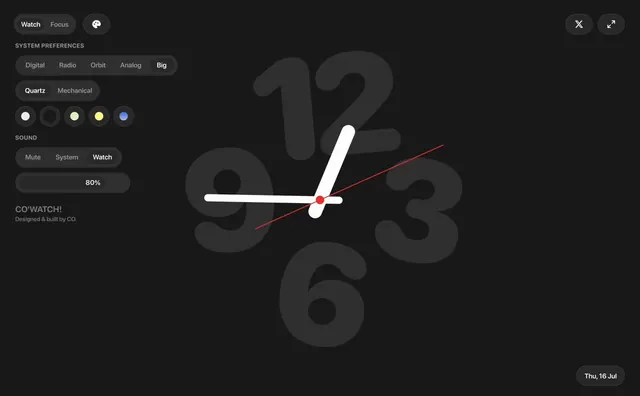
A clock app concept with an analog watch face and theme-switching preferences panel cycling through dark, light, and yellow color modes.
More like this
See all

Summary
A clock app concept with an analog watch face and theme-switching preferences panel cycling through dark, light, and yellow color modes.
Visual description
A dark watch customization interface shows a large analog clock face in the center with bold gray numerals and white hands set to approximately 10:10. The left sidebar contains preference tabs for watch style and color swatches, with sound controls below. System preferences are stacked at top in pill-shaped buttons, while branding appears at bottom left in small gray text.
Key takeaway
Use a large centered preview with controls radiating outward in organized sections. Group related options by visual hierarchy: primary tabs first, secondary toggles and color pickers below, metadata at bottom.
Reuse notes
Reach for this as a ui screen reference. Pairs with typographic, minimal directions. Original by HASSCO.