Preview image. Unlock full-res
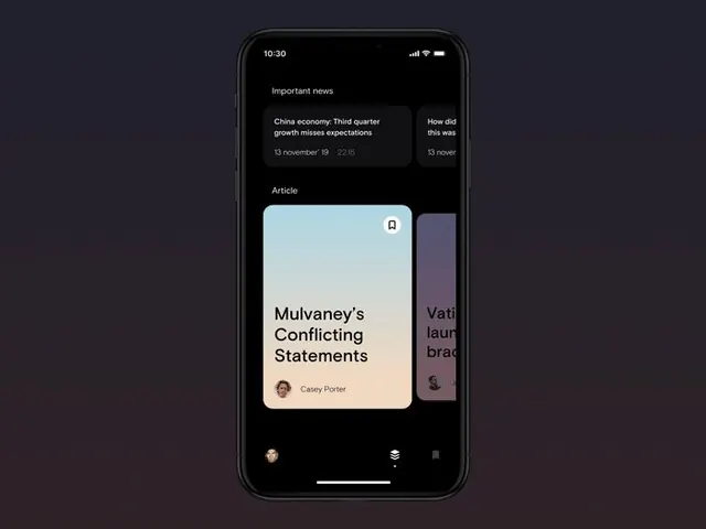
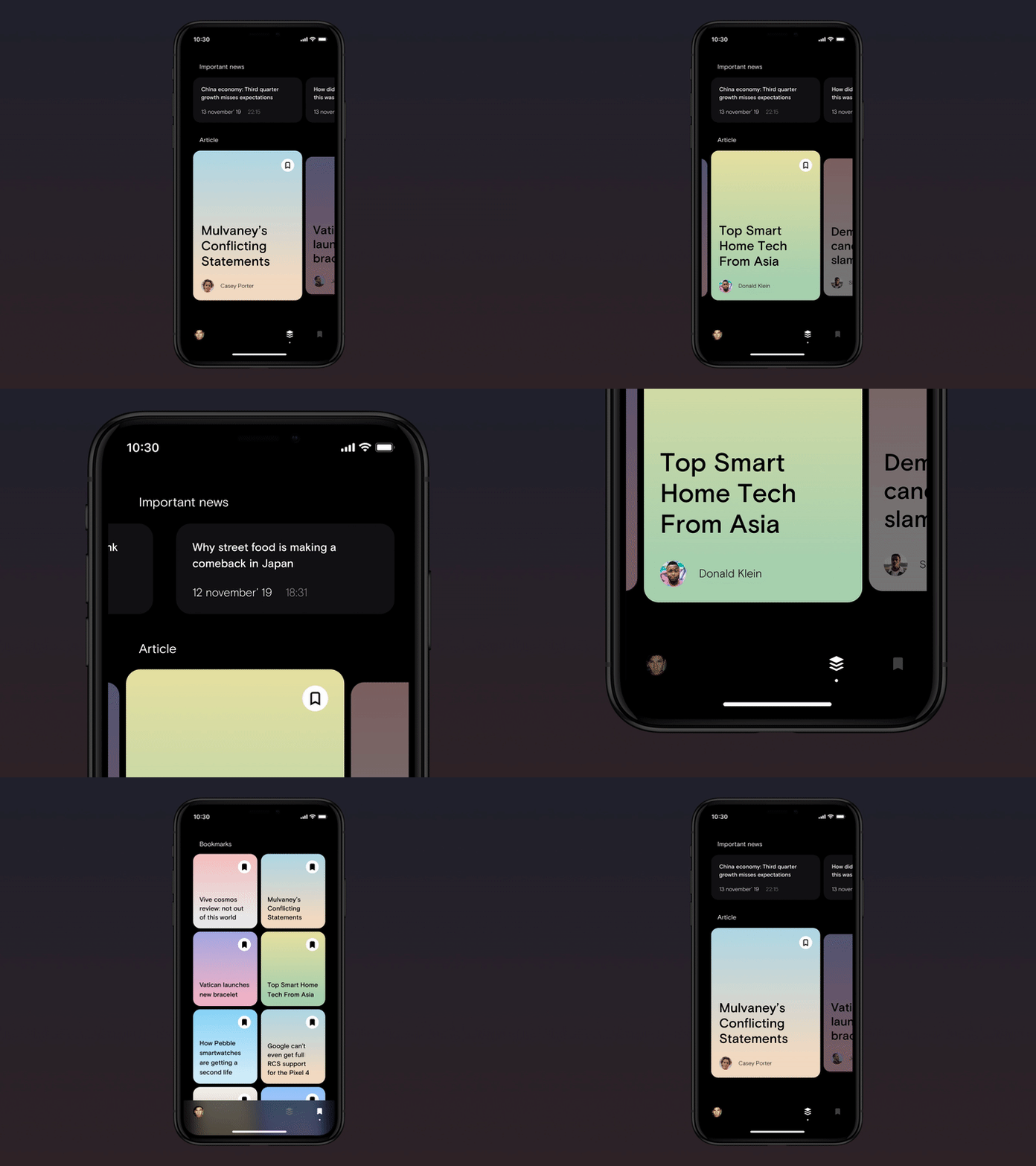
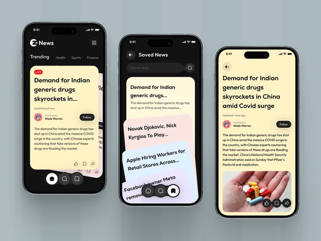
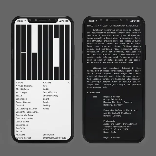
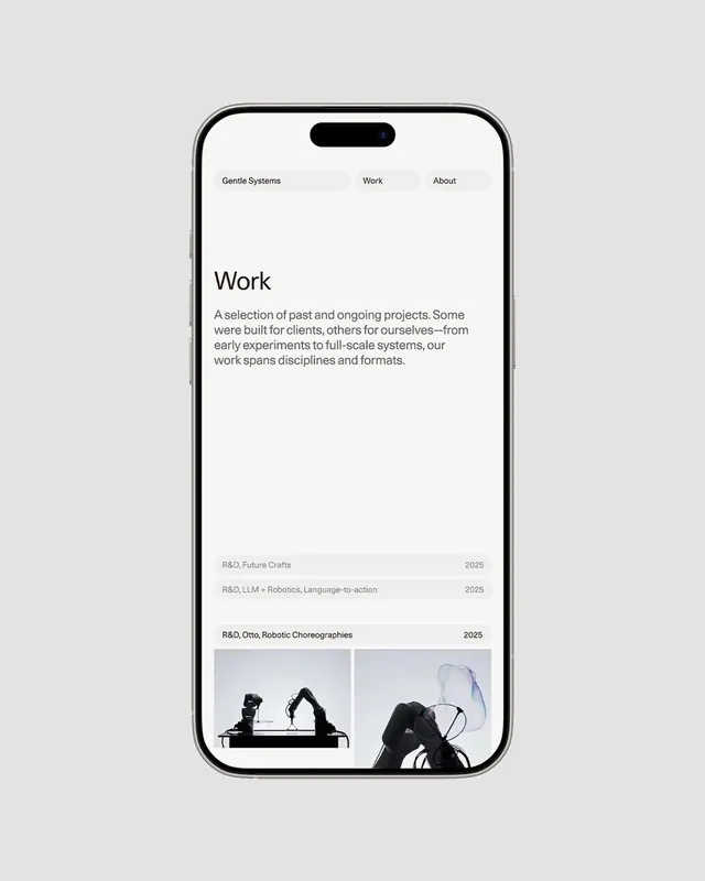
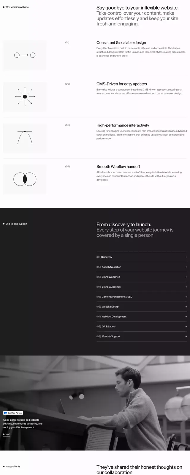
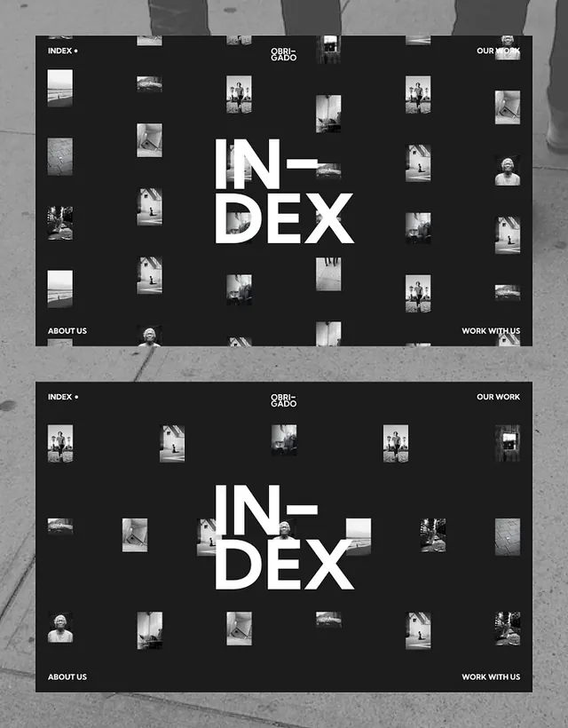
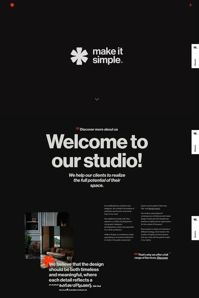
The design utilizes a stark contrast between pure black and white, establishing a minimalist and professional editorial feel.
Summary
The design utilizes a stark contrast between pure black and white, establishing a minimalist and professional editorial feel.
Visual description
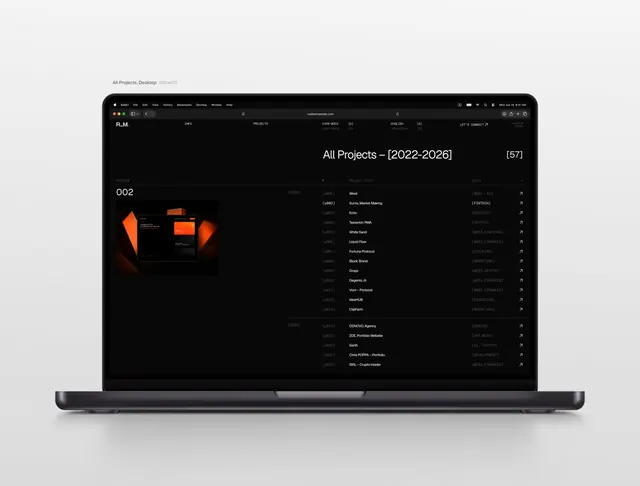
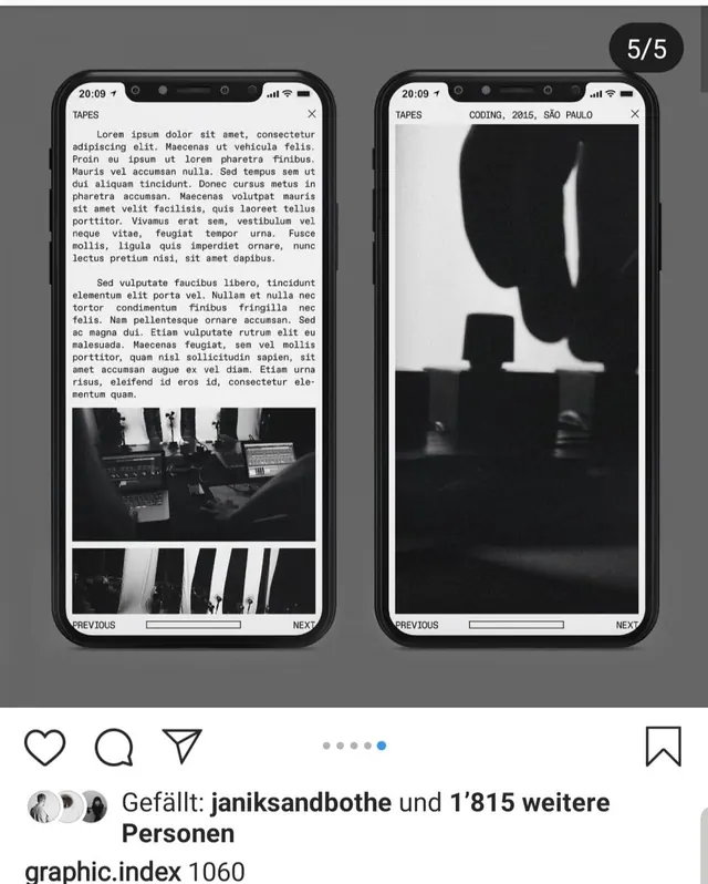
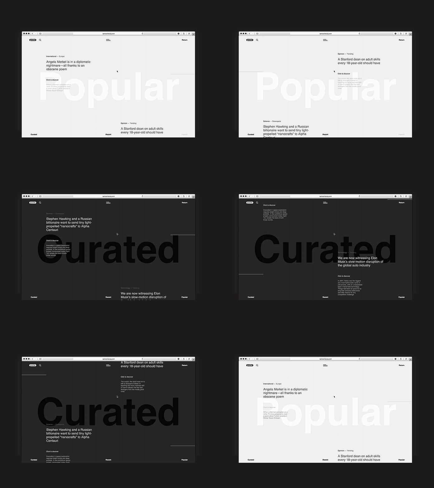
The design utilizes a stark contrast between pure black and white, establishing a minimalist and professional editorial feel. The layout is clean and structured, employing generous negative space to ensure high readability for the featured content. The composition is balanced, centering the content within a clean white frame that separates it effectively from the dark background. Clean, modern sans-serif web fonts are used for high readability and a contemporary feel.
Key takeaway
An ui screen reference. Worth saving for its minimalist, dark mode, editorial treatment.
Reuse notes
Fits media work.